
.svg)
The df.plot() function in pandas is a flexible and easy way to create plots from data in DataFrame objects. It is built on top of Matplotlib, a comprehensive library for creating static, animated, and interactive visualizations in Python. The df.plot() function provides a simple way to produce a variety of plot types, including line plots, bar plots, histograms, scatter plots, and more. Here's how it works and some examples to demonstrate its capabilities.
Basic Syntax
The basic syntax of the df.plot() function is:
DataFrame.plot(x=None, y=None, kind='line', ax=None, figsize=None, title=None, grid=None, legend=True, style=None, logx=False, logy=False, loglog=False, xticks=None, yticks=None, xlim=None, ylim=None, rot=None, fontsize=None, colormap=None, table=False, yerr=None, xerr=None, label=None, secondary_y=False, **kwds)- x, y: Labels of the columns in the DataFrame to be used as x and y coordinates.
- kind: The type of plot to produce:
'line'(default): Line plot'bar'or'barh': Bar plot (horizontal or vertical)'hist': Histogram'box': Boxplot'kde'or'density': Kernel Density Estimation plot'area': Area plot'pie': Pie plot'scatter': Scatter plot (requiresxandy)'hexbin': Hexbin plot (requiresxandy)
- ax: An instance of Matplotlib's
axesobject. Allows plotting on a specific subplot. - figsize: A tuple (width, height) in inches for the figure size.
- title: Title of the plot.
- grid: Boolean value to display or hide grid lines.
- legend: Boolean value to display or hide the legend.
- Other parameters provide more customization like log scale, axis limits, rotations, font size, etc.
Examples: Let's create some example plots using a sample DataFrame.Each of these examples demonstrates a different type of plot you can create using the df.plot() function. By adjusting the parameters and the data you pass to the function, you can generate a wide range of visualizations to explore and present your data.
import pandas as pd
import numpy as np
# Sample DataFrame
df = pd.DataFrame({
'A': np.random.randn(50).cumsum(),
'B': np.random.randn(50).cumsum(),
'C': np.random.randn(50).cumsum()
})
# Line Plot
df.plot(title='Line Plot')
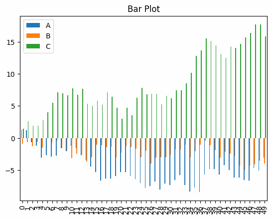
# Bar Plot
df.plot(kind='bar', title='Bar Plot')
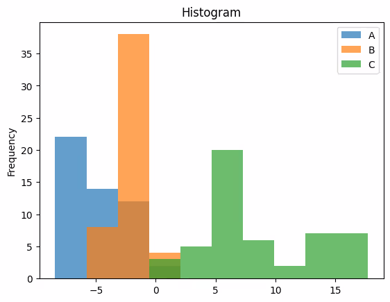
# Histogram
df.plot(kind='hist', alpha=0.7, title='Histogram')
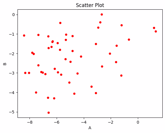
# Scatter Plot
df.plot(kind='scatter', x='A', y='B', title='Scatter Plot', color='red')
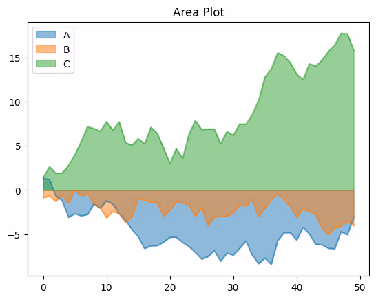
# Area Plot
df.plot(kind='area', stacked=False, title='Area Plot')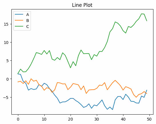
# Python Program to find the area of triangle

a = 5
b = 6
c = 7

# Uncomment below to take inputs from the user
# a = float(input('Enter first side: '))
# b = float(input('Enter second side: '))
# c = float(input('Enter third side: '))

# calculate the semi-perimeter
s = (a + b + c) / 2

# calculate the area
area = (s*(s-a)*(s-b)*(s-c)) ** 0.5
print('The area of the triangle is %0.2f' %area)
.svg)


.avif)
