
.svg)
Getting Started with Matplotlib
Matplotlib is a comprehensive library for creating static, animated, and interactive visualizations in Python. It has become the de facto standard for plotting in Python, offering a wide range of functionality and flexibility to produce high-quality graphs and plots. This guide will introduce you to Matplotlib, covering its background, how to set it up, and an overview of its core components.
Introduction to Matplotlib, Its History, and Its Ecosystem
- Background: Matplotlib was created by John D. Hunter in 2003. Hunter, a neurobiologist, was seeking a plotting tool with the capabilities of MATLAB's plotting features, but in Python. Hence, Matplotlib was developed to fill this gap, and over the years, it has grown into a powerful library supported by a large community of developers and users.
- Ecosystem: Matplotlib is part of the broader scientific computing ecosystem in Python, which includes libraries such as NumPy for numerical computations, pandas for data manipulation, and SciPy for scientific computing. Matplotlib integrates well with these libraries, making it a central component for data visualization in Python.
Setting Up the Environment and Installing Matplotlib
To start using Matplotlib, you first need to set up your Python environment. It's highly recommended to use a virtual environment for Python projects to manage dependencies effectively.
- Install Python: Ensure you have Python installed. Python 3.6 or later is recommended.
- Create a Virtual Environment (optional but recommended):
- On macOS and Linux:
python3 -m venv myenv - On Windows:
py -m venv myenv
- On macOS and Linux:
- Activate the Virtual Environment:
- On macOS and Linux:
source myenv/bin/activate - On Windows:
.\myenv\Scripts\activate
- On macOS and Linux:
- Install Matplotlib:
- With the environment activated, install Matplotlib using pip:
pip install matplotlib
- With the environment activated, install Matplotlib using pip:
A Walkthrough of Matplotlib's Architecture (Figure, Axes, Axis, etc.)
Matplotlib's architecture is designed around a few key concepts:
- Figure: The whole figure or window in the GUI context. It's the top-level container for all plot elements. You can think of the Figure as a canvas on which plots are drawn. A figure can contain multiple Axes.
- Axes: This is what you might think of as 'a plot'. An Axes contains two (or three in the case of 3D) Axis objects which take care of the data limits, and it is the area on which data is plotted with functions like
plot()andscatter(), including labels, ticks, and the plot background. A figure can contain multiple Axes. - Axis: These are the number-line-like objects. They take care of setting the graph limits and generating the ticks (the marks on the Axis) and ticklabels (strings labeling the ticks).
- Artist: Everything you can see on the figure is an artist, including Figure, Axes, and Axis objects, but also text, lines, and images.
The structure is hierarchical: a Figure can contain multiple Axes, each Axes can contain multiple Axis objects, and each Axis object can contain multiple tick marks. Understanding this hierarchy is crucial for customizing your plots in advanced ways.
Summary
This introduction covered the basics of getting started with Matplotlib, including its history, how to set it up, and an overview of its architecture. Understanding these fundamentals is the first step toward becoming proficient in creating plots and visualizations with Matplotlib. Next, we'll dive into creating basic plots and customizing them to suit our needs.
Matplotlib provides two primary interfaces for creating visualizations: the pyplot API and the Object-Oriented (OO) API. Understanding the differences between these interfaces and when to use each is crucial for effective plotting and visualization in Python. Additionally, understanding how figures and subplots work within these interfaces allows for the creation of complex multi-plot layouts.
Pyplot API
- Overview: The
pyplotAPI is a collection of functions that make Matplotlib work like MATLAB. Each pyplot function makes some change to a figure, such as creating a figure, creating a plotting area, plotting some lines, decorating the plot with labels, etc. - Use Case: It is particularly useful for quick and easy plotting, interactive use, and simple scripts. The
pyplotAPI is stateful; it keeps track of the current figure and plotting area, and the plotting functions are directed to the current axes. - Example
import matplotlib.pyplot as plt

plt.plot([1, 2, 3], [4, 5, 6])
plt.title('Pyplot Example')
plt.xlabel('x-axis')
plt.ylabel('y-axis')
plt.show()
Object-Oriented API
- Overview: The Object-Oriented API is recommended for more complex plots and for when you need more control over your visualization. Instead of relying on the stateful environment that
pyplotprovides, it utilizes an object-oriented approach, making it more suitable for applications that require more detailed settings or the integration of plots into larger applications. - Use Case: Ideal for creating complex plots, embedding Matplotlib in GUI applications, and scripts that require a higher degree of customization and reuse of plotting components.
- Example:
import matplotlib.pyplot as plt

fig, ax = plt.subplots()  # Create a figure and an axes.
ax.plot([1, 2, 3], [4, 5, 6])
ax.set_title('OO API Example')
ax.set_xlabel('x-axis')
ax.set_ylabel('y-axis')
plt.show()
Figure and Subplots
- Figure: In Matplotlib, the whole window or the entire image can be considered a
Figureobject. Within this figure, there can be one or moreAxesor plots. EachFigurecan contain multiple childAxesas well as a title, which is a text drawn above all theAxes. - Subplots: Subplots are a way to arrange multiple Axes (plots) within a single Figure. They can be dynamically adjusted and customized. The
plt.subplots()function is a convenient way to create both a Figure and a set of subplots in one call.- Creating Subplots: The function returns a Figure and an array of Axes objects, allowing for efficient creation of multi-plot layouts.
- Example
fig, axs = plt.subplots(2, 2)  # Creates a grid of 2x2 subplots (4 in total)
axs[0, 0].plot([1, 2, 3], [4, 5, 6])
axs[0, 1].scatter([1, 2, 3], [4, 5, 6])
axs[1, 0].bar([1, 2, 3], [4, 5, 6])
axs[1, 1].hist([1, 2, 3, 4, 5, 6])
plt.show()
Understanding these interfaces and components is essential for effective and efficient plotting in Matplotlib. While the pyplot API offers convenience and simplicity, the Object-Oriented API grants the flexibility needed for creating complex visualizations. Figures and subplots are foundational concepts that allow you to organize and display your data visually in a structured manner.
Your First Matplotlib Plot
Creating visualizations with Matplotlib starts with understanding its submodule pyplot, which provides a MATLAB-like interface for making plots and figures. This guide will walk you through creating your first plot, focusing on a simple line graph, and explain the basic components involved.
Basics of Plotting with Pyplot: Creating Figures and Axes
Matplotlib’s pyplot module simplifies the process of creating figures and axes. Here’s a step-by-step guide:
1. Import Matplotlib: First, you need to import the pyplot module. It’s customary to import it as plt for ease of use
import matplotlib.pyplot as plt
2. Creating a Figure and Axes: While pyplot can automatically create a figure and axes for you when you plot something, it's good practice to explicitly create them. This gives you more control over your plot
fig, ax = plt.subplots() # This creates a figure and a single subplot (axes)Here, fig is the Figure object, and ax is the Axes object. For now, think of the figure as the canvas and the axes as the part of the canvas on which you will plot your data.
Plotting Your First Graph (Line Graph)
Let's plot a simple line graph of three points.
1. Define Data: Define the x and y coordinates of the points.
 x = [1, 2, 3]
 y = [2, 4, 1]
2. Plot Data: Use the plot method on the Axes object to plot your data.
ax.plot(x, y)3. Show Plot: Finally, display the plot using plt.show().
plt.show()
Putting it all together:
import matplotlib.pyplot as plt

# Create figure and axes
fig, ax = plt.subplots()

# Data points
x = [1, 2, 3]
y = [2, 4, 1]

# Plot data on the axes
ax.plot(x, y)

# Display the plot
plt.show()
- Figure: This is the overall window or page that everything is drawn on. You can have multiple figures.
- Axes: This area where your data is plotted. A figure can contain many Axes.
- Line Plot: The line connecting the data points is created by the
plotfunction. - Axis Labels: To add labels to the x and y-axis, use
ax.set_xlabel('x label')andax.set_ylabel('y label'). - Title: To add a title to your axes, use
ax.set_title('Title').
To add these components, modify the plotting code as follows:
# Create figure and axes
fig, ax = plt.subplots()

# Plot data
ax.plot(x, y)

# Adding a title and labels
ax.set_title('Simple Plot')
ax.set_xlabel('x label')
ax.set_ylabel('y label')

# Show the plot
plt.show()
Congratulations! You've just created your first Matplotlib plot. Experiment with different data points, titles, and labels to see how the plot changes. This is just the beginning—Matplotlib offers extensive functionality to customize your plots in various ways, which you'll learn more about as you progress.
import matplotlib.pyplot as plt

# Create figure and axes
fig, ax = plt.subplots()

# Data points
x = [1, 2, 3]
y = [2, 4, 1]

# Plot data on the axes
ax.plot(x, y)

# Display the plot
plt.show()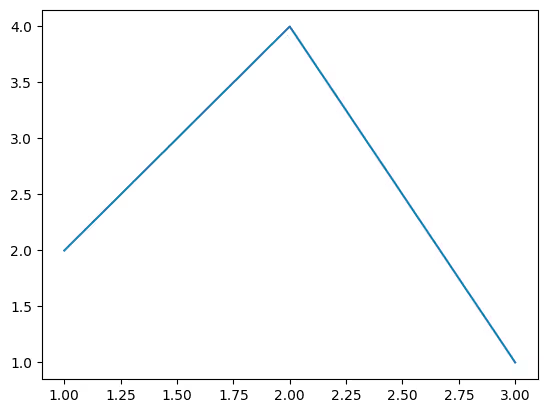
Creating a comprehensive example that demonstrates various customization options in Matplotlib can provide a deep insight into how flexible and powerful the library can be for data visualization. Let's create a detailed example that includes customizing colors, markers, line styles, adding annotations, and more. We'll visualize a simple dataset that shows a company's monthly revenue over a year, compare it to the previous year, and highlight significant points.
Example: Detailed Customization in Matplotlib
Step 1: Preparing Data
Let's assume we have monthly revenue data for two consecutive years:
import numpy as np

# Months
months = np.arange(1, 13)

# Revenue data (in thousands)
revenue_2022 = np.array([10, 15, 14, 18, 20, 25, 24, 26, 27, 30, 28, 35])
revenue_2023 = np.array([12, 17, 13, 20, 22, 28, 27, 29, 30, 32, 34, 38])
Step 2: Basic Plot Setup
Start by creating a figure and axes, and plot both years' revenue data with different styles.
import matplotlib.pyplot as plt

fig, ax = plt.subplots(figsize=(10, 6))  # Set the figure size for better readability

# Plotting both years with different colors and line styles
ax.plot(months, revenue_2022, color='skyblue', linestyle='--', marker='o', label='2022 Revenue')
ax.plot(months, revenue_2023, color='orange', linestyle='-', marker='x', label='2023 Revenue')
Step 3: Enhancing the Plot
Let's add enhancements to make the plot more informative and appealing.
# Add a grid for better readability
ax.grid(True, which='both', linestyle='--', linewidth=0.5)

# Add titles and labels
ax.set_title('Monthly Revenue Comparison: 2022 vs 2023', fontsize=16, fontweight='bold')
ax.set_xlabel('Month', fontsize=14)
ax.set_ylabel('Revenue (in thousands)', fontsize=14)

# Customize tick labels
ax.set_xticks(months)
ax.set_xticklabels(['Jan', 'Feb', 'Mar', 'Apr', 'May', 'Jun', 'Jul', 'Aug', 'Sep', 'Oct', 'Nov', 'Dec'], rotation=45)
ax.tick_params(axis='both', which='major', labelsize=12)

# Highlight significant points
# Highlight the highest revenue month in 2023
highest_revenue_month = np.argmax(revenue_2023) + 1
highest_revenue = np.max(revenue_2023)
ax.annotate('Highest\n2023', xy=(highest_revenue_month, highest_revenue), xytext=(highest_revenue_month+0.5, highest_revenue+2),
            arrowprops=dict(facecolor='black', shrink=0.05), fontsize=12)

# Adding a legend
ax.legend(loc='upper left', fontsize=12)

# Show the plot
plt.tight_layout()
plt.show()
import numpy as np

# Months
months = np.arange(1, 13)

# Revenue data (in thousands)
revenue_2022 = np.array([10, 15, 14, 18, 20, 25, 24, 26, 27, 30, 28, 35])
revenue_2023 = np.array([12, 17, 13, 20, 22, 28, 27, 29, 30, 32, 34, 38])
import matplotlib.pyplot as plt

fig, ax = plt.subplots(figsize=(10, 6))  # Set the figure size for better readability

# Plotting both years with different colors and line styles
ax.plot(months, revenue_2022, color='skyblue', linestyle='--', marker='o', label='2022 Revenue')
ax.plot(months, revenue_2023, color='orange', linestyle='-', marker='x', label='2023 Revenue')
# Add a grid for better readability
ax.grid(True, which='both', linestyle='--', linewidth=0.5)

# Add titles and labels
ax.set_title('Monthly Revenue Comparison: 2022 vs 2023', fontsize=16, fontweight='bold')
ax.set_xlabel('Month', fontsize=14)
ax.set_ylabel('Revenue (in thousands)', fontsize=14)

# Customize tick labels
ax.set_xticks(months)
ax.set_xticklabels(['Jan', 'Feb', 'Mar', 'Apr', 'May', 'Jun', 'Jul', 'Aug', 'Sep', 'Oct', 'Nov', 'Dec'], rotation=45)
ax.tick_params(axis='both', which='major', labelsize=12)

# Highlight significant points
# Highlight the highest revenue month in 2023
highest_revenue_month = np.argmax(revenue_2023) + 1
highest_revenue = np.max(revenue_2023)
ax.annotate('Highest\n2023', xy=(highest_revenue_month, highest_revenue), xytext=(highest_revenue_month+0.5, highest_revenue+2),
            arrowprops=dict(facecolor='black', shrink=0.05), fontsize=12)

# Adding a legend
ax.legend(loc='upper left', fontsize=12)

# Show the plot
plt.tight_layout()
plt.show()
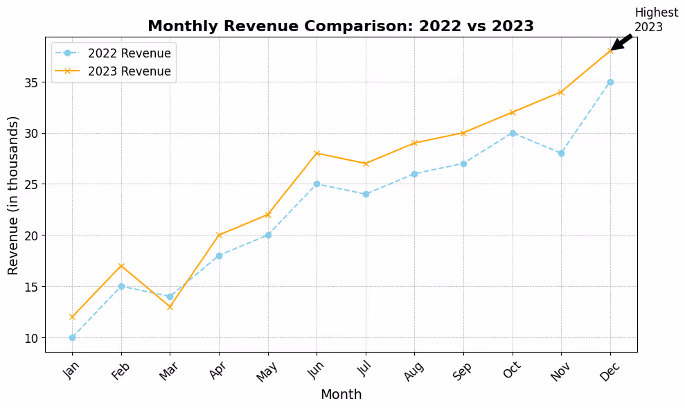
Explanation of Customizations
- Figure Size:
figsize=(10, 6)sets the dimensions of the figure for better visibility. - Plot Colors and Styles: Different colors (
color), line styles (linestyle), and markers (marker) distinguish the two data series visually. - Grid:
ax.grid(True)adds a background grid, which helps in reading the plot. - Titles and Labels: Customized title and axis labels (
set_title,set_xlabel,set_ylabel) with specified font sizes enhance the plot's readability. - Custom Tick Labels: Setting custom tick labels on the x-axis to show month names makes the plot more intuitive.
- Highlighting Points: Using
ax.annotateto highlight and annotate a specific data point (the highest revenue month in 2023) draws attention to significant plot features. - Legend:
ax.legend()adds a legend to the plot, which is crucial for distinguishing between multiple datasets.
This example demonstrates just a fraction of Matplotlib's customization capabilities, showing how these options can be combined to create informative and visually appealing data visualizations. Experimentation and exploration of Matplotlib's extensive documentation can reveal even more customization techniques and plot types.
# Python Program to find the area of triangle

a = 5
b = 6
c = 7

# Uncomment below to take inputs from the user
# a = float(input('Enter first side: '))
# b = float(input('Enter second side: '))
# c = float(input('Enter third side: '))

# calculate the semi-perimeter
s = (a + b + c) / 2

# calculate the area
area = (s*(s-a)*(s-b)*(s-c)) ** 0.5
print('The area of the triangle is %0.2f' %area)
.svg)


.avif)
