

This comprehensive guide teaches you how to use Matplotlib to visualise data. It also includes an essential data visualisation technique tutorial and a step-by-step Method for unlocking the power of Python data visualisation for impactful insights.
Introduction – What is Matplotlib?
Data visualisation techniques in Python often begin with Matplotlib, an open-source plotting library. As one of the most fundamental tools for data visualisation, it is essential for creating static, animated, and interactive visualisations. Whether you're a beginner or an expert, Matplotlib is the first library to master for effective data visualisation in Python.
Why use Matplotlib?
- Simple and Straightforward: If you're just starting with data visualisation, Matplotlib is your go-to. It's the foundation of most Python visualisation libraries, so learning it first makes it easier to understand tools like Seaborn later. Matplotlib keeps it simple—no fancy setup or plugins, just straight-to-the-point plotting.
- Ultimate Flexibility: Matplotlib gives you full control over every aspect of your visualisation.
- Best for Static Visuals: There’s no beating Matplotlib if you use it right, for static visuals which don’t require JavaScript or HTML.
- Huge Community and Resources: Since it’s been around the longest, Matplotlib has a massive user base. That means tons of tutorials, forums, and examples are out there to help you when you get stuck.
- Works Great With Others: It plays well with Seaborn and Pandas. Seaborn, for instance, is built on top of Matplotlib, which means you can combine what they each do best—Seaborn for quick, gorgeous plots and Matplotlib to fine-tune them.
- Perfect for Beginners: Other libraries often assume familiarity with Matplotlib. Starting here gives you an understanding of the basics—like plot types, axes, and labels—which makes tackling advanced tools much easier later.
- Industry-Wide Usage: From entry-level data analysts to seasoned scientists, everyone trusts Matplotlib.
Installing Matplotlib
Pip Installation
Like any other library, installing matplotlib is fairly straightforward.

Prerequisites
Before installing Matplotlib, it’s highly recommended to have fundamental knowledge of Pandas and Numpy. When installing Matplotlib using Pip, most core dependencies are installed automatically.
Verification
Want to make sure everything worked? Do a quick test:
- Open your Python shell by typing `python` or `python3` in the terminal.
- Type this in the Python shell:

- If you see a version number (like `3.4.3`), it worked. If not, double-check the steps above.
That’s it! You’re done installing Matplotlib. Now let’s get started.
Pyplot
pyplot is a module within Matplotlib that provides a simple interface for creating visualisations. It is designed to mimic MATLAB's plotting functionality, making it easy to create and customize plots with minimal code. Most of the plotting functions in Matplotlib are available through pyplot. It is commonly abbreviated as plt and in most cases, you’ll be importing only this module from Matplotlib.
Matplotlib Chart Elements
Before we get started with visualisations, one of the key benefits of Matplotlib is the ability to customise chart elements. Think of Matplotlib as a blank canvas where you can paint your masterpiece. To understand the key components—Figure, Axes, Axis, and Artists—let’s use a relatable analogy: a painting on a canvas in a frame.
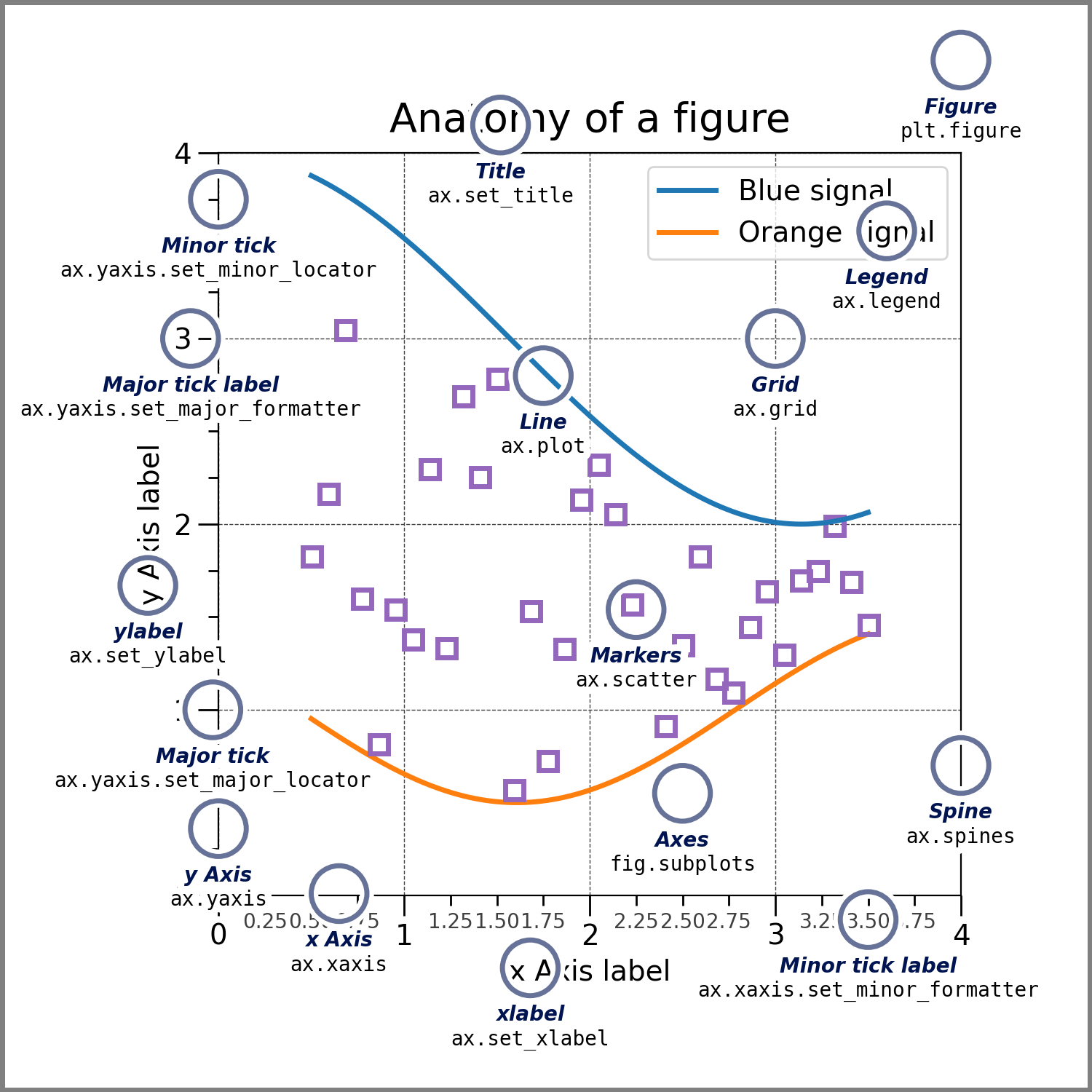
1. Figure: The Big Picture (The Frame)
The Figure is like the frame that holds your entire painting. It’s the outermost container where everything lives—your plots, titles, legends, and even blank space.
- What it does: It’s the "big box" that contains all the plots (subplots) and decorations.
- Key point: Without a Figure, there’s no place to draw anything.
Example:
If you have multiple plots (like a grid of subplots), the Figure is the thing that holds all of them together.
2. Axes: The Canvas (Where You Paint)
The Axes (not to be confused with "Axis") is the actual canvas where you draw your plot. It’s the part inside the frame (Figure) where the magic happens.
- What it does: It’s where you plot your data—lines, bars, scatter points, etc.
- Key point: A Figure can have one or more Axes (like multiple canvases in one frame).
Example:
If you’re making a grid of 2x2 subplots, each subplot is an Axes.
3. Axis: The Rulers (X and Y Lines)
The Axis is like the ruler on the edges of your canvas. It helps you measure and understand the data by showing the scale (e.g., numbers on the x-axis and y-axis).
- What it does: It’s the horizontal (x-axis) and vertical (y-axis) lines with tick marks and labels.
- Key point: Each Axes (canvas) has its own pair of Axes (rulers).
Example:
If you’re plotting a graph of time vs. temperature, the x-axis might show time (e.g., seconds), and the y-axis might show temperature (e.g., degrees).
4. Artists: The Paint (Everything You See)
The Artists are like the paint on the canvas. They’re everything you see on the plot—lines, points, text, legends, titles, etc.
- What it does: Artists are the actual visual elements that make up your plot.
- Key point: Everything you see in a Matplotlib plot is an Artist.
Example:
- A line in a line plot? That’s an Artist.
- The title of the plot? Also an Artist.
- The tick marks on the axes? Yep, Artists too.
Matplotlib Application Interfaces
Think of Matplotlib as a tool for drawing pictures (plots) of your data. It gives you two main ways to do this: Pyplot and Object-Oriented (OO) Interface. Let’s dive in!
The Pyplot Interface
This is like using a whiteboard and markers. You just start drawing, and Matplotlib figures out where to put things for you. It’s quick, simple, and great for small, straightforward plots.
How it works:
- You call functions like plt.plot() or plt.title() to add stuff to your plot.
- Matplotlib keeps track of the "current figure" and "current axes" (the plot area) for you, so you don’t have to worry about managing them.
Here’s an example:
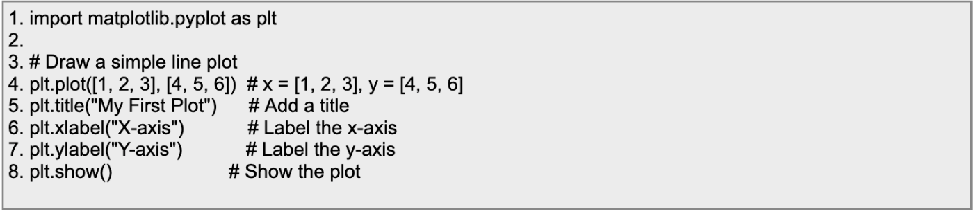
The main drawback of this is that it is inefficient if you’re writing long code, or want customisation.
The Object Oriented Interface
This approach provides more flexibility by directly creating and manipulating objects, and avoids reliance on the current state of plots.
Here’s an example:
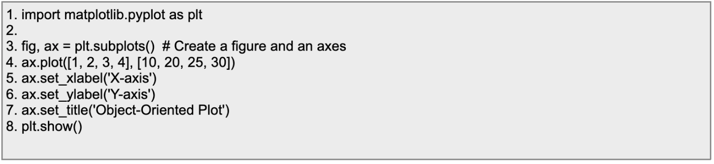
We’ll go with the Object oriented interface in this article.
Preparing and Loading the Data
It’s highly likely you’ll be loading data from an external source, which is one of the reasons Pandas is a prerequisite for Matplotlib.
We won’t get into the details of it, for that you can check out our guide to data cleaning with Pandas.
Creating the masterpiece
So, your data is ready. What next? There’s two ways to go about this:
- The Expediter: The grid-based option
- The Control-freak: Manual positioning
In most cases, you’d go with the grid option, so let’s approach that first
The Grid
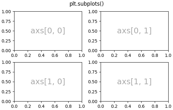
To set the layout of subplots, we use the subplots() function.

Note that subplots() does two things at once. It creates a figure (fig) and creates a grid of size 2x2 within the figure. axs refers to the array of the same size.
In the above example, you can see the grid is 2x2.
Syntax for subplots()

Parameters:
- nrows:
- The number of rows in the grid of subplots.
- ncols:
- The number of columns in the grid of subplots.
- index:
- The position of the subplot in the grid (counted row-wise, starting from 1).
- **kwargs:
- Additional keyword arguments for advanced customization.
An alternative approach
We know that you can create a quick grid of subplots using the subplots() function, but there’s another way you can go about things.
First, create a figure using figure(), then use add_subplot().
Figure() creates a blank canvas, also known as – you guessed it, a figure.
Syntax for figure()

Parameters:
- num (optional):
- A unique identifier for the figure (can be an integer or a string).
- If a figure with the same num already exists, it will be selected instead of creating a new one.
- figsize (optional):
- Specifies the size of the figure in inches as a tuple (width, height).
- Default: (6.4, 4.8) inches.
- dpi (optional):
- Dots per inch (resolution) of the figure.
- Default: 100.
- facecolor (optional):
- Background color of the figure.
- Default: 'white'.
- edgecolor (optional):
- Color of the figure's border.
- Default: 'white'.
- frameon (optional):
- Whether to draw the figure frame (True/False).
- Default: True.
- **kwargs:
- Additional keyword arguments for advanced customization.
Think of add_subplot() as a way to carve out one plot at a time within the figure. With this method, you create figure-level control and manually define each individual subplot.
- You start by specifying the total grid setup (rows and columns) and which "slot" the current subplot belongs to.
- This is handy if you want to build subplots piece by piece, or if you want non-symmetrical layouts.
Here’s how you’d create a 2x2 grid and add plots one by one:
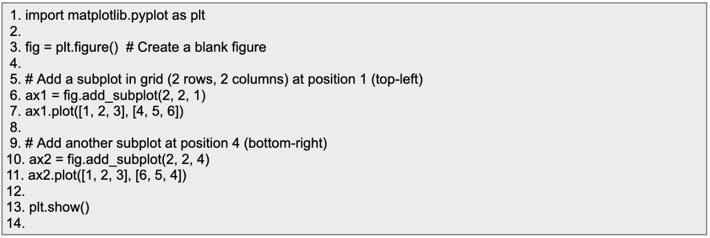
Use add_subplot() when you need full control over the placement of subplots, and you’re fine with adding them one by one.
Customising the Axes
Think of the figure and axes objects as your blank canvas and drawing area. You’re the artist, and Matplotlib is your toolkit!
Here’s how you can customize plots step by step using the Object Oriented approach:
Step 1. Set Up Your Canvas (Figure and Axes)
The OO approach starts with creating a Figure (the overall canvas) and Axes (the area where you draw your plot). Like this:
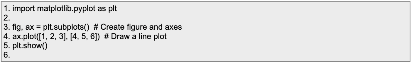
Now that you’ve got your canvas, let’s style it up!
Step 2: Adding Titles and Labels
With the OO approach, you use ax.set_title() for the title and ax.set_xlabel()/ax.set_ylabel() for the axes labels.
Example:
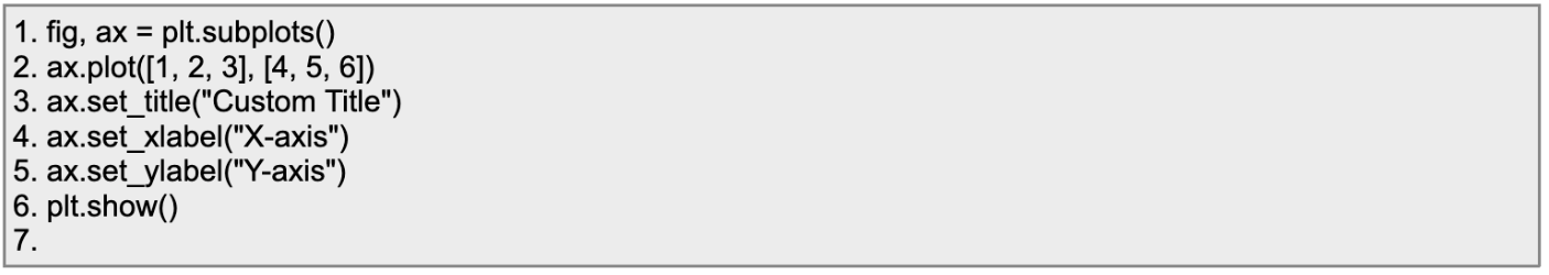
This gives your audience a clear understanding of what your plot is about.
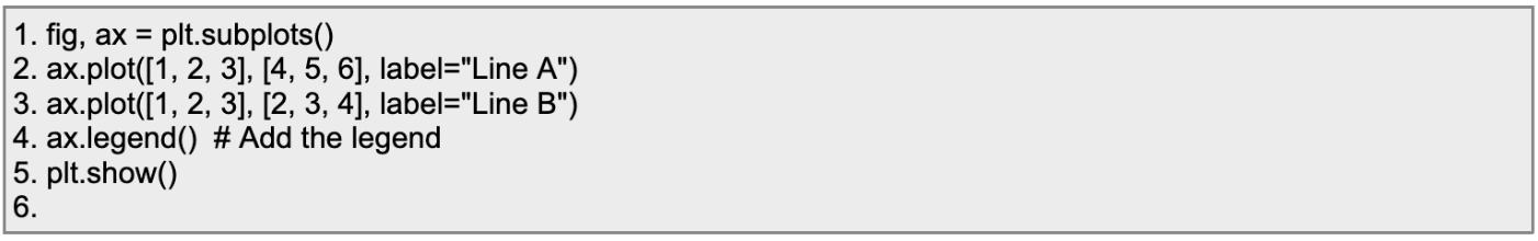
Step 3: Working with Legends
Legends are added using ax.legend(). But first, don’t forget to assign a label to your plot!
Example:
Step 4: Customizing Colors and Line Styles
Colors and styles work the same way here but are applied when calling ax.plot().
To customize the color:
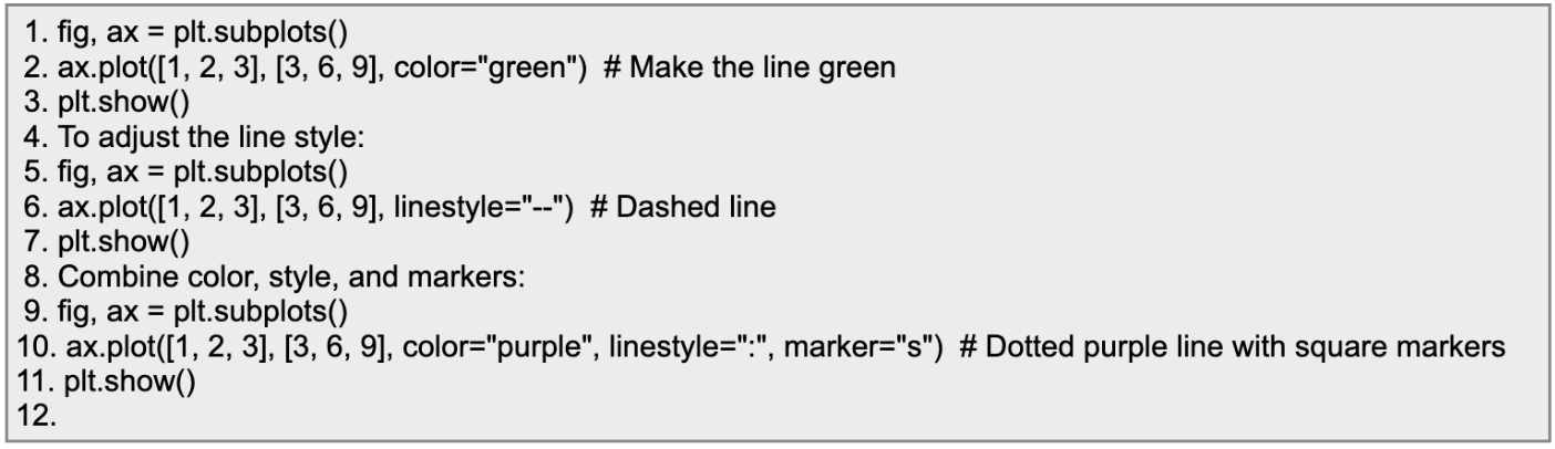
Experiment with these to make your charts visually appealing!
Step 5: Add gridlines
Gridlines help make plots cleaner and easier to read. Turn them on with ax.grid().
Example:
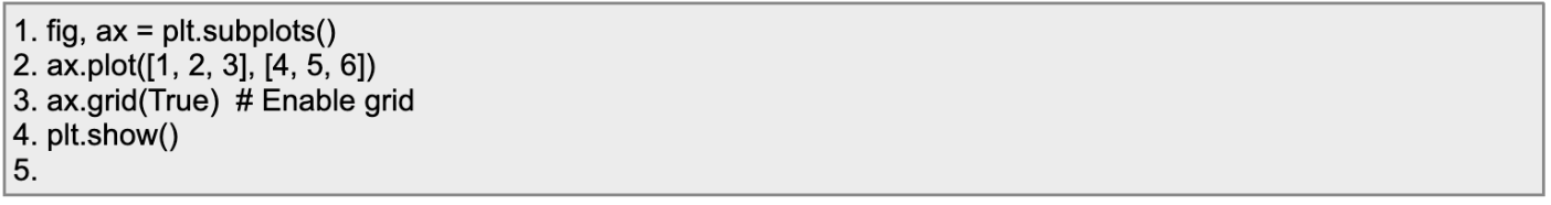
You can customize the grid style too by adding arguments like color, linestyle, etc.
Customising the Figure
When working with Matplotlib, the figure acts as your plot’s main canvas. Customizing it can make a huge difference in how your visualisations look and feel. From adjusting the size to tweaking colors and improving resolution, you have plenty of ways to make your figure shine. Here’s a quick guide to getting started!
Using figure()
You can customise the attributes of a figure while creating it using the figure() function.

Parameters:
- num (optional):
- The unique identifier for the figure.
- If a figure with this number already exists, it will be selected and made active.
- If None or not provided, a new figure is created.
- Example: num=1
- figsize (optional):
- Specifies the width and height of the figure in inches.
- Format: (width, height)
- Example: figsize=(8, 6)
- dpi (optional):
- Dots per inch (resolution) of the figure.
- Higher values result in better quality but larger file sizes.
- Example: dpi=100
- facecolor (optional):
- The background color of the figure.
- Example: facecolor='lightgray'
- edgecolor (optional):
- The color of the figure's border.
- Example: edgecolor='blue'
- frameon (optional):
- A boolean to specify whether the figure frame (border) is drawn.
- Default: True
- Example: frameon=False
- FigureClass (optional):
- Allows you to specify a custom subclass of matplotlib.figure.Figure.
- Default: <class 'matplotlib.figure.Figure'>
- clear (optional):
- If True, clears an existing figure with the same num before creating a new one.
- Default: False
- **kwargs:
- Additional keyword arguments passed to the Figure class.
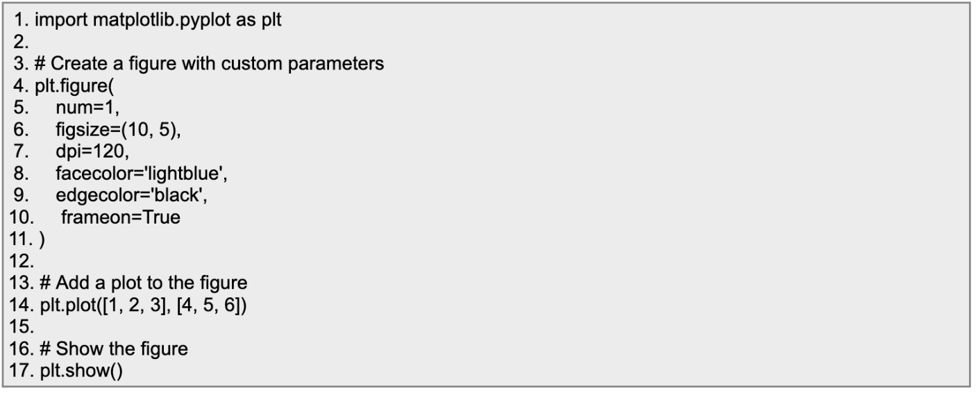
For example, let’s create a figure with a light blue background, black border, and a resolution of 120 DPI, sized 10 inches wide by 5 inches tall:
Setter Methods
The set_ functions in Matplotlib are called "setter methods". They are part of the object-oriented API in Matplotlib and are used to modify the properties of objects like Figure, Axes, or Artist (e.g., lines, text, etc.).
Here are some common setter methods:
Figure Object Setter Methods
- set_facecolor(color): Sets the background color of the figure.
- set_size_inches(width, height): Sets the size of the figure in inches.
- set_dpi(dpi): Sets the resolution (dots per inch) of the figure.
Axes Object Setter Methods
- set_title(title): Sets the title of the axes.
- set_xlabel(label): Sets the label for the x-axis.
- set_ylabel(label): Sets the label for the y-axis.
- set_xlim(left, right): Sets the limits of the x-axis.
- set_ylim(bottom, top): Sets the limits of the y-axis.
Artist Object Setter Methods
- set_color(color): Sets the color of a line or text.
- set_linewidth(width): Sets the width of a line.
- set_alpha(alpha): Sets the transparency of an object.
Saving and Exporting Plots
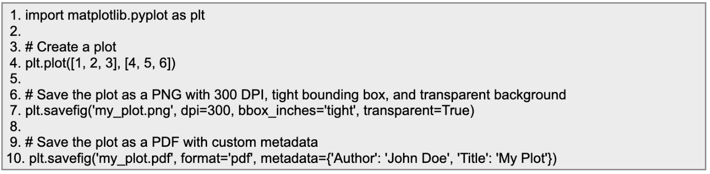
After you've spent all that time crafting the perfect plot in Matplotlib, you probably want to save it so you can share it with the world, or stick it in a report, or even just show it off to your friends. Luckily, Matplotlib makes this super easy with the savefig() function.
Let’s look at this function in action:
Conclusion
Matplotlib stands as a powerhouse in the world of data visualisation, offering users limitless possibilities to turn data into insightful, stunning visuals. From basic line graphs and scatter plots to intricate custom charts, its versatility makes it an invaluable tool for beginners and experts alike. With its customization options, you can tweak every detail to suit your needs—colors, labels, layouts, you name it. Plus, the ability to save and export plots ensures your creations can be used across reports, presentations, and more.
Whether you're exploring trends, presenting findings, or just experimenting with data, Matplotlib empowers you to visualise information effectively and creatively. Now it's your turn to dive in, tinker, and bring your data to life. The more you explore, the more you'll discover its potential to elevate your projects. Happy plotting!


.avif)
