
.svg)
Lesson 2.1: Basic Plot Types
Matplotlib supports a wide array of plot types, each serving different purposes depending on the nature and structure of the data. This lesson will introduce you to some of the basic plot types and how to customize them to make your visualizations more informative and appealing.
Introduction to Various Plot Types
- Scatter Plots:
- Purpose: Used to observe relationships between variables.
- Example:
import matplotlib.pyplot as plt
x = [5, 7, 8, 7, 2, 17, 2, 9, 4, 11, 12, 9, 6]
y = [99, 86, 87, 88, 100, 86, 103, 87, 94, 78, 77, 85, 86]
plt.scatter(x, y)
plt.title('Scatter Plot Example')
plt.xlabel('X')
plt.ylabel('Y')
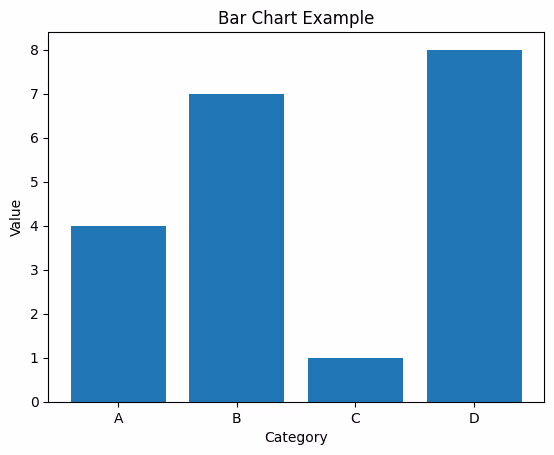
plt.show()Bar Charts:
- Purpose: Useful for comparing different groups or to track changes over time.
- Example
import matplotlib.pyplot as plt
categories = ['A', 'B', 'C', 'D']
values = [4, 7, 1, 8]
plt.bar(categories, values)
plt.title('Bar Chart Example')
plt.xlabel('Category')
plt.ylabel('Value')
plt.show()
Histograms:
- Purpose: Great for showing the distribution of a dataset; how often values fall into ranges.
- Example
import matplotlib.pyplot as plt
data = [1, 2, 1, 3, 3, 1, 4, 2]
plt.hist(data, bins=4)
plt.title('Histogram Example')
plt.xlabel('Bins')
plt.ylabel('Frequency')
plt.show()
Pie Charts:
- Purpose: Useful for showing parts of a whole, illustrating proportions or percentages.
- Example:
import matplotlib.pyplot as plt
slices = [7, 2, 2, 13]
categories = ['A', 'B', 'C', 'D']
plt.pie(slices, labels=categories)
plt.title('Pie Chart Example')
plt.show()
Customizing Plots: Colors, Markers, Line Styles
Customization is key to making your plots communicate information more effectively. Here's how to customize the appearance of your plot
1. Colors: You can specify colors in many ways in Matplotlib, including by name ('blue'), hex strings ('#008000'), RGB or RGBA tuples ((0,1,0,1)), and more
plt.scatter(x, y, color='red') 2. Markers: Markers are used in scatter plots to indicate each point. You can change the marker style with the marker parameter.
plt.scatter(x, y, marker='x') 3. Line Styles: When plotting line graphs, you can customize the line style using the linestyle parameter.
plt.plot(x, y, linestyle='--')Additional customizations include adding a grid, customizing tick labels, and adding annotations to point out specific features of the data. Experimenting with these customizations will help you create more effective and visually appealing plots.
Summary
This lesson introduced you to the basics of plotting with Matplotlib, covering several fundamental plot types and how to customize them. As you become more familiar with these tools, you'll be able to explore more complex data visualizations and tailor your plots to your specific needs.
- Scatter Plots:
- Purpose: Used to observe relationships between variables.
- Example:
import matplotlib.pyplot as plt
x = [5, 7, 8, 7, 2, 17, 2, 9, 4, 11, 12, 9, 6]
y = [99, 86, 87, 88, 100, 86, 103, 87, 94, 78, 77, 85, 86]
plt.scatter(x, y)
plt.title('Scatter Plot Example')
plt.xlabel('X')
plt.ylabel('Y')
plt.show()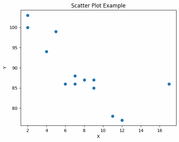
import numpy as np
import matplotlib.pyplot as plt
import pandas as pd

# Seed for reproducibility
np.random.seed(0)

# Generate synthetic data
n = 50  # number of data points
study_hours = np.random.uniform(1, 20, n)
test_scores = study_hours * 5 + np.random.normal(0, 5, n)  # Add some noise
performance_level = np.where(test_scores > 80, 'High', 'Low')  # Categorize based on test score

# Create a DataFrame for easier handling
df = pd.DataFrame({
    'Study Hours': study_hours,
    'Test Scores': test_scores,
    'Performance': performance_level
})
df.head().avif)
plt.scatter(df['Study Hours'], df['Test Scores'])
plt.title('Scatter Plot between test score and study hours')
plt.xlabel('study hours')
plt.ylabel('test score')
plt.show()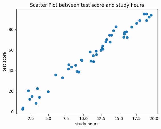
performance_colors = df['Performance'].map({'High': 'blue', 'Low': 'red'})
fig, ax = plt.subplots(figsize=(10, 6))  # Create figure and axes objects

# Plot with colors based on performance level
scatter = ax.scatter(df['Study Hours'], df['Test Scores'], c=performance_colors)

# Customizations
ax.set_title('Test Scores by Study Hours', fontsize=15)
ax.set_xlabel('Study Hours', fontsize=12)
ax.set_ylabel('Test Scores', fontsize=12)
ax.grid(True, which='both', linestyle='--', linewidth=0.5)
from matplotlib.lines import Line2D
legend_elements = [Line2D([0], [0], marker='o', color='w', markerfacecolor='blue', markersize=10, label='High'),
                   Line2D([0], [0], marker='o', color='w', markerfacecolor='red', markersize=10, label='Low')]
ax.legend(handles=legend_elements, title='Performance Level')
plt.show()
fig, ax = plt.subplots(figsize=(10, 6))  # Create figure and axes objects

# Plot using different colors for different performance levels
colors = {'High': 'blue', 'Low': 'red'}
grouped = df.groupby('Performance')
for key, group in grouped:
    group.plot(ax=ax, kind='scatter', x='Study Hours', y='Test Scores', label=key, color=colors[key])

# Customizations
ax.set_title('Test Scores by Study Hours', fontsize=15)
ax.set_xlabel('Study Hours', fontsize=12)
ax.set_ylabel('Test Scores', fontsize=12)
ax.grid(True, which='both', linestyle='--', linewidth=0.5)
ax.legend(title='Performance Level')
plt.show()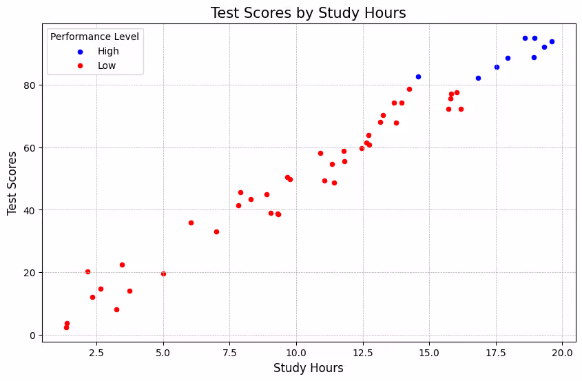
Bar Charts:
- Purpose: Useful for comparing different groups or to track changes over time.
- Example:
     import matplotlib.pyplot as plt
     categories = ['A', 'B', 'C', 'D']
     values = [4, 7, 1, 8]
     plt.bar(categories, values)
     plt.title('Bar Chart Example')
     plt.xlabel('Category')
     plt.ylabel('Value')
     plt.show()
import numpy as np

# Sample data: Average monthly sales
months = ['Jan', 'Feb', 'Mar', 'Apr', 'May', 'Jun', 'Jul', 'Aug', 'Sep', 'Oct', 'Nov', 'Dec']
sales = np.array([200, 220, 250, 275, 300, 320, 310, 305, 290, 270, 240, 230])

# Colors based on performance (optional)
colors = ['red' if sale < 250 else 'green' for sale in sales]
fig, ax = plt.subplots(figsize=(12, 8))  # Create figure and axes objects

# Create bars
bars = ax.bar(months, sales, color=colors, edgecolor='black', linewidth=1)

# Customizations
ax.set_title('Average Monthly Sales - 2023', fontsize=16, fontweight='bold')
ax.set_xlabel('Month', fontsize=14)
ax.set_ylabel('Sales', fontsize=14)
plt.show()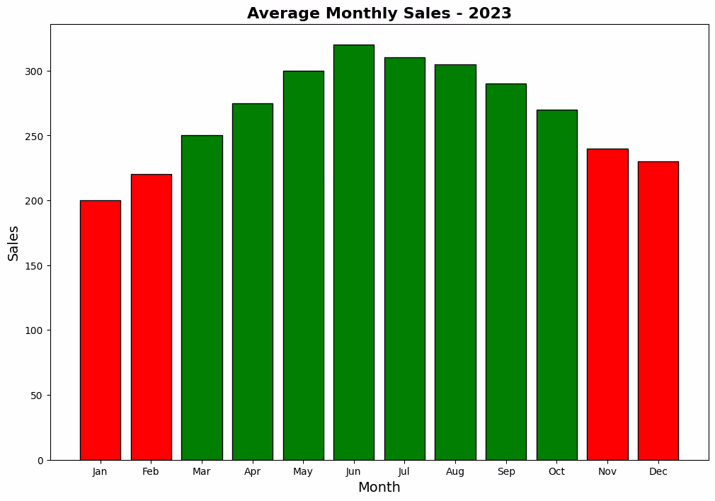
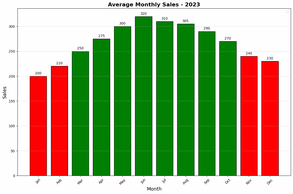
fig, ax = plt.subplots(figsize=(12, 8))  # Create figure and axes objects

# Create bars
bars = ax.bar(months, sales, color=colors, edgecolor='black', linewidth=1)

# Customizations
ax.set_title('Average Monthly Sales - 2023', fontsize=16, fontweight='bold')
ax.set_xlabel('Month', fontsize=14)
ax.set_ylabel('Sales', fontsize=14)
ax.set_xticks(range(len(months)))
ax.set_xticklabels(months, rotation=45)
ax.grid(True, which='both', axis='y', linestyle='--', linewidth=0.5)

# Add data labels
for bar in bars:
    height = bar.get_height()
    ax.annotate(f'{height}',
                xy=(bar.get_x() + bar.get_width() / 2, height),
                xytext=(0, 3),  # 3 points vertical offset
                textcoords="offset points",
                ha='center', va='bottom')

plt.tight_layout()
plt.show()
import numpy as np

# Seed for reproducibility
np.random.seed(0)

# Generate synthetic exam scores for 100 students
scores = np.random.normal(loc=70, scale=15, size=100)  # mean=70, std=15
import matplotlib.pyplot as plt

fig, ax = plt.subplots(figsize=(10, 6))  # Create figure and axes objects

# Create histogram
n, bins, patches = ax.hist(scores, bins=10, color='skyblue', edgecolor='black')

# Customizations
ax.set_title('Distribution of Exam Scores', fontsize=15)
ax.set_xlabel('Score', fontsize=12)
ax.set_ylabel('Number of Students', fontsize=12)
ax.grid(True, which='both', axis='y', linestyle='--', linewidth=0.5)

# Highlight the mean score
mean_score = np.mean(scores)
ax.axvline(mean_score, color='red', linestyle='--', linewidth=2)
ax.text(mean_score + 2, 10, f'Mean: {mean_score:.2f}', color = 'red')

plt.show()
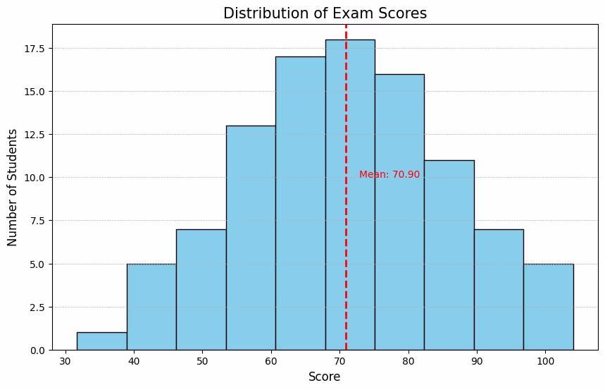
Explanation of the Customizations:
- Figure and Axes: The figure size is adjusted for clarity.
- Histogram Creation: The
histmethod creates the histogram. Thebinsparameter controls the number of intervals or bins. Thecolorandedgecolorparameters customize the appearance of the bars. - Titles and Labels: Setting the title and labels for the x-axis (score) and y-axis (number of students) provides context.
- Grid: Adding a grid on the y-axis helps estimate the number of students per score interval.
- Mean Score Highlight: An axvline is drawn at the mean score with a contrasting color and style, and a text annotation provides the exact value. This adds a significant reference point to the distribution, showing where the center of the data lies.
This example demonstrates how to create and customize a histogram in Matplotlib, providing insights into the distribution of data points across a range of values. Histograms are particularly useful for understanding the spread and central tendency of data in a visual format.
How To include a density curve on a histogram in Matplotlib
import matplotlib.pyplot as plt
from scipy.stats import gaussian_kde

# Create figure and axes objects
fig, ax = plt.subplots(figsize=(10, 6))

# Calculate the density
density = gaussian_kde(scores)
density.covariance_factor = lambda: .25  # Smoothing parameter
density._compute_covariance()

# Set up the histogram: normalize it and choose the bins
n, bins, patches = ax.hist(scores, bins=10, density=True, alpha=0.5, color='skyblue', edgecolor='black')

# Plot the density curve
xs = np.linspace(min(scores), max(scores), 1000)
ax.plot(xs, density(xs), color='red', linewidth=2)

# Customizations
ax.set_title('Exam Score Distribution with Density Curve', fontsize=15)
ax.set_xlabel('Score', fontsize=12)
ax.set_ylabel('Density', fontsize=12)
ax.grid(True, which='both', axis='y', linestyle='--', linewidth=0.5)

plt.show()
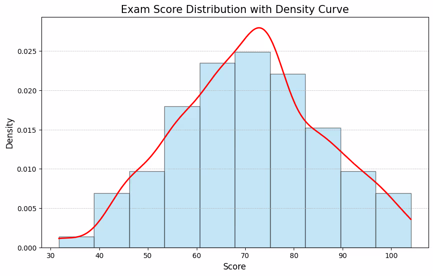
To include a density curve on a histogram in Matplotlib, you can use the probability density function (PDF) to plot the curve. This involves calculating the PDF for the dataset and overlaying it on the histogram. Here's how you can do it, continuing with the example of the distribution of exam scores:
Explanation:
- Density Calculation:
gaussian_kdefromscipy.statsis used to compute the Kernel Density Estimate (KDE), which is a way to estimate the probability density function (PDF) of a random variable. Thecovariance_factoris adjusted to control the smoothness of the resulting curve. - Histogram: The
densityparameter in thehistfunction is set toTrueto normalize the histogram, which allows the histogram to be plotted on the same scale as the density curve. - Density Curve: The density curve is plotted over the histogram by calculating the density's values across a range of scores (
xs). This curve provides a smooth estimate of the distribution. - Customizations: The figure is customized with titles, labels, and a grid for clarity.
This approach effectively overlays a smooth density curve on top of a normalized histogram, providing a visual representation of the data's distribution in addition to the empirical distribution shown by the histogram.
Pie Chart
Creating a pie chart in Matplotlib is a straightforward way to visualize data in proportional segments. Pie charts are most effective with a small number of categories, where each slice can represent a part of a whole. Here’s an example that demonstrates how to create a pie chart with various customizations, including segment labels, colors, and a legend.
Example: Market Share Visualization
Suppose we have data on the market share of five companies in the tech industry. We'll create a pie chart to visualize these proportions.
# Company names
companies = ['Company A', 'Company B', 'Company C', 'Company D', 'Company E']

# Market shares as percentages
market_shares = [25, 35, 20, 15, 5]

# Colors for each segment
colors = ['skyblue', 'orange', 'lightgreen', 'gold', 'purple']
import matplotlib.pyplot as plt

fig, ax = plt.subplots()
ax.pie(market_shares, labels=companies, autopct='%1.1f%%', startangle=140, colors=colors)

# Customizations
ax.set_title('Tech Industry Market Share - 2023', fontsize=15)
plt.axis('equal')  # Equal aspect ratio ensures the pie chart is circular.

# Create a legend
plt.legend(companies, title="Companies", loc="center left", bbox_to_anchor=(1, 0, 0.5, 1))

plt.show()
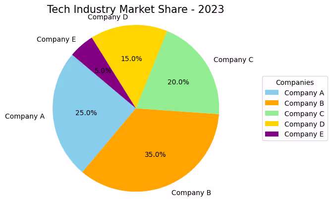
Explanation of the Customizations:
- Labels: The
labelsparameter is used to specify the label for each pie segment, representing the company names in this case. - Percentage: The
autopctparameter allows you to display the percent value using Python string formatting. For example,%1.1f%%will show the percentage with one decimal place. - Start Angle: The
startangleparameter controls where the first segment of the pie starts. Setting it to 140 degrees rotates the pie chart for better visual alignment. - Colors: The
colorsparameter assigns custom colors to each segment for a more colorful and distinguishable chart. - Title: Adds a title to the chart to provide context.
- Aspect Ratio:
plt.axis('equal')ensures the pie chart is drawn as a circle rather than an ellipse. - Legend: A legend is added outside the pie chart by adjusting the
bbox_to_anchorparameter, which helps identify the companies each segment represents.
This example demonstrates how to create a simple, yet informative, pie chart using Matplotlib. By customizing labels, colors, and the chart's appearance, you can effectively communicate the relative sizes of categorical data. Pie charts like this are widely used in presentations and reports to represent data in a visually appealing and easy-to-understand format.
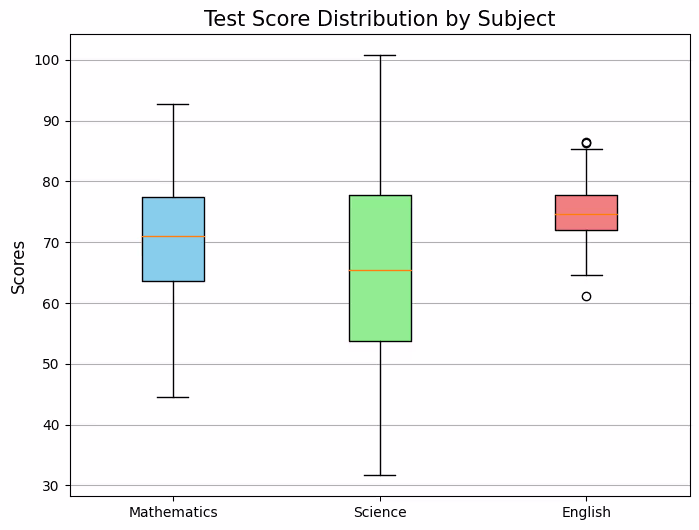
BOX PLOT
Box plots, also known as box-and-whisker plots, are a standardized way of displaying the distribution of data based on a five-number summary: minimum, first quartile (Q1), median, third quartile (Q3), and maximum. They are particularly useful for comparing distributions between several groups or sets of data. Here’s an example that demonstrates how to create box plots with various customizations, using Matplotlib.
Example: Student Test Scores by Subject
Suppose we have test scores for a group of students across three subjects: Mathematics, Science, and English. We want to compare the distributions of scores across these subjects.
Step 1: Prepare the Data
Let's define the scores for each subject.
import numpy as np

# Seed for reproducibility
np.random.seed(0)

# Generating synthetic test scores
math_scores = np.random.normal(70, 10, 100)  # mean=70, std=10
science_scores = np.random.normal(65, 15, 100)  # mean=65, std=15
english_scores = np.random.normal(75, 5, 100)  # mean=75, std=5

scores = [math_scores, science_scores, english_scores]
subjects = ['Mathematics', 'Science', 'English']
import matplotlib.pyplot as plt

fig, ax = plt.subplots(figsize=(8, 6))
bplot = ax.boxplot(scores, patch_artist=True, labels=subjects, notch=False, vert=True)

# Customizations
colors = ['skyblue', 'lightgreen', 'lightcoral']
for patch, color in zip(bplot['boxes'], colors):
    patch.set_facecolor(color)

ax.set_title('Test Score Distribution by Subject', fontsize=15)
ax.set_ylabel('Scores', fontsize=12)
ax.yaxis.grid(True)  # Add a grid

plt.show()
import numpy as np

# Seed for reproducibility
np.random.seed(0)

# Generating synthetic test scores
math_scores = np.random.normal(70, 10, 100)  # mean=70, std=10
science_scores = np.random.normal(65, 15, 100)  # mean=65, std=15
english_scores = np.random.normal(75, 5, 100)  # mean=75, std=5

scores = [math_scores, science_scores, english_scores]
subjects = ['Mathematics', 'Science', 'English']
import matplotlib.pyplot as plt

fig, ax = plt.subplots(figsize=(8, 6))
bplot = ax.boxplot(scores, patch_artist=True, labels=subjects, notch=True, vert=False)

# Customizations
colors = ['skyblue', 'lightgreen', 'yellow']
for patch, color in zip(bplot['boxes'], colors):
    patch.set_facecolor(color)

ax.set_title('Test Score Distribution by Subject', fontsize=15)
ax.set_ylabel('Scores', fontsize=12)
ax.yaxis.grid(True)  # Add a grid

plt.show()
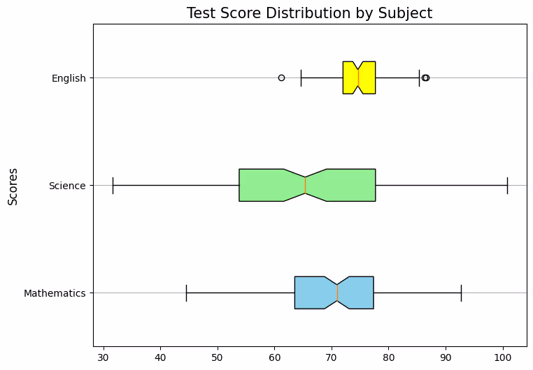
Explanation of the Customizations:
- Box Colors: The
patch_artist=Trueparameter allows the boxes to be filled. We use a loop to set the face color of each box to make them more distinguishable. - Labels: The
labelsparameter is used to specify the label for each box plot, representing the subjects in this case. - Notches: Setting
notch=Truecreates a notch in the box plot around the median. This can give a rough indication of the uncertainty about the median's estimate. - Orientation: The
vert=Trueparameter plots the box plots vertically, which is the conventional orientation for box plots. - Title and Axis Label: Adds a title to the chart and labels the y-axis to provide context.
- Grid:
ax.yaxis.grid(True)adds a horizontal grid to the plot, which helps in assessing the data points' distribution across the scale.
This example demonstrates how to create and customize box plots using Matplotlib to compare the distribution of scores across different subjects. Box plots provide a concise summary of data distributions with their quartiles and outliers, making them invaluable for statistical analysis and comparison.
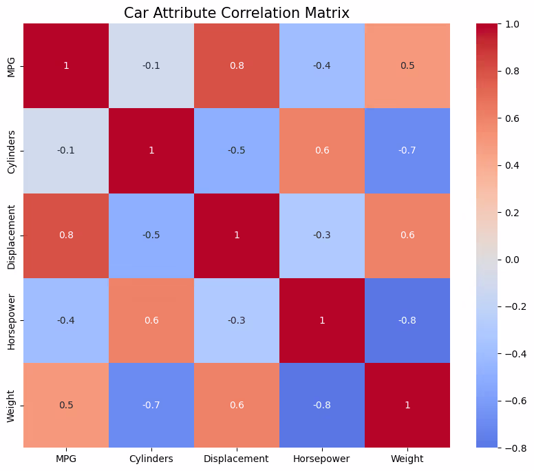
heat map
Heatmaps are a great way to visualize complex data in a two-dimensional matrix, where colors represent values. They are particularly useful for highlighting trends, variations across a dataset, and correlations between two variables. Here’s an example that demonstrates how to create a heatmap using Matplotlib, along with Seaborn, a Python visualization library that provides a high-level interface for drawing attractive statistical graphics, including heatmaps.
Example: Correlation Matrix Heatmap
Let’s say we want to visualize the correlation matrix of a dataset containing different attributes of cars, like MPG (Miles per Gallon), Cylinders, Displacement, Horsepower, and Weight.
Step 1: Prepare the Data
For this example, we'll create a synthetic correlation matrix since the focus is on creating the heatmap.
Explanation:
- Creating the Heatmap:
sns.heatmapis used to create the heatmap. The first argument is the data to be visualized, which is our correlation matrix here. - Annotations: The
annot=Trueparameter displays the data value in each cell, making it easier to see the exact correlation value. - Labels:
xticklabelsandyticklabelsare set to the names of the attributes to label the axes accordingly. - Color Map: The
cmap='coolwarm'parameter sets the color scheme to "coolwarm", which is effective for showing the gradient from negative to positive correlations. Thecenter=0parameter ensures that the color scheme is centered on zero, making positive correlations warm (red) and negative correlations cool (blue). - Title: Adds a title to the heatmap for context.
This example demonstrates how to create a visually appealing heatmap to represent the correlation matrix of a dataset using Seaborn and Matplotlib. Heatmaps like this are widely used in data analysis for exploring and presenting correlations and patterns in data.
import numpy as np

# Seed for reproducibility
np.random.seed(0)

# Synthetic correlation matrix
data = np.array([[1, -0.1, 0.8, -0.4, 0.5],
                 [-0.1, 1, -0.5, 0.6, -0.7],
                 [0.8, -0.5, 1, -0.3, 0.6],
                 [-0.4, 0.6, -0.3, 1, -0.8],
                 [0.5, -0.7, 0.6, -0.8, 1]])

attributes = ['MPG', 'Cylinders', 'Displacement', 'Horsepower', 'Weight']
import seaborn as sns
import matplotlib.pyplot as plt

# Create a heatmap
plt.figure(figsize=(10, 8))
sns.heatmap(data, annot=True, xticklabels=attributes, yticklabels=attributes, cmap='coolwarm', center=0)

# Customizations
plt.title('Car Attribute Correlation Matrix', fontsize=15)
plt.show()
# Python Program to find the area of triangle

a = 5
b = 6
c = 7

# Uncomment below to take inputs from the user
# a = float(input('Enter first side: '))
# b = float(input('Enter second side: '))
# c = float(input('Enter third side: '))

# calculate the semi-perimeter
s = (a + b + c) / 2

# calculate the area
area = (s*(s-a)*(s-b)*(s-c)) ** 0.5
print('The area of the triangle is %0.2f' %area)
.svg)


.avif)
