
.svg)
Understanding the components of subplots in Matplotlib is key to creating complex and well-organized plots. Let's break down the main components involved when working with subplots step by step.
Figure
- Definition: The figure is the top-level container in Matplotlib. It includes everything visualized in the plot, such as one or more axes, graphics, text, and labels. You can think of the figure as the window or page on which everything is drawn.
- Creation: Use
plt.figure()to start a new figure. Parameters likefigsizecan set the figure dimensions.
Axes
- Definition: Axes are what we commonly think of as a plot. An axes object contains two (or three for 3D) Axis objects (be aware of the difference between Axes and Axis) responsible for the data limits. The axes also contain all the various plot elements, including the actual line or scatter plots, legends, text, and labels.
- Creation: When you create a subplot, Matplotlib adds axes to the figure. This can be done with commands like
fig.add_subplot(),plt.subplots(), orplt.axes().
Subplots
- Definition: Subplots are a way to arrange multiple axes (plots) within a single figure. They allow you to easily compare different plots in a structured layout.
- Creation: Use
plt.subplots(nrows, ncols)to create a figure and a grid of subplots. This function returns a figure object and an array of axes objects.
Axis
- Definition: The Axis objects handle the axis part of a plot, setting the graph limits and generating the ticks (the marks on the axis) and tick labels (strings labeling the ticks). Each axes object contains two (or three for 3D) Axis objects.
- Customization: You can customize the appearance of ticks, tick labels, and axis labels using methods like
set_xticks(),set_xticklabels(), andset_xlabel()for the x-axis, with analogous methods for the y-axis.
Ticks and Tick Labels
- Definition: Ticks are the markers denoting data points on the axes, while tick labels are the names given to those ticks.
- Customization: Control the appearance and position of ticks and labels with
ax.set_xticks(),ax.set_xticklabels(), and similar methods for the y-axis. The appearance can be finely tuned withax.tick_params().
Grid
- Definition: A grid can be added to the background of the plot for better readability of the graph.
- Usage: Use
ax.grid()to add a grid to an axes object. It's customizable with parameters for line style, width, and color.
Legend
- Definition: A legend explains the symbols, colors, or line types used in the plot. It's essential for plots that include multiple data series.
- Creation: Add a legend using
ax.legend(). The legend automatically associates labels with the plot elements.
Title and Labels
- Definition: Titles and labels add context to the plot, explaining what data is being shown and how it's measured.
- Usage: Set a title for the axes with
ax.set_title()and label the axes withax.set_xlabel()andax.set_ylabel().
Spacing
- Definition: The layout and spacing between subplots can significantly impact the readability of the plot.
- Adjustment: Use
plt.tight_layout()to automatically adjust the spacing between subplots to prevent overlap.plt.subplots_adjust()offers more control over spacing.
Overall Workflow Example
Creating a plot with multiple subplots typically follows this workflow:
- Create a Figure: Start by defining a figure that will contain all subplots.
- Add Subplots to the Figure: Specify the number of rows and columns of subplots.
- Customize Each Axes: Plot data and customize each subplot with titles, labels, legends, etc.
- Adjust Layout: Use layout adjustments to ensure clear presentation without overlap.
- Display or Save the Plot: Finally, show the plot on the screen or save it to a file.
Understanding and utilizing these components allows for the creation of complex, informative, and visually appealing plots in Matplotlib.
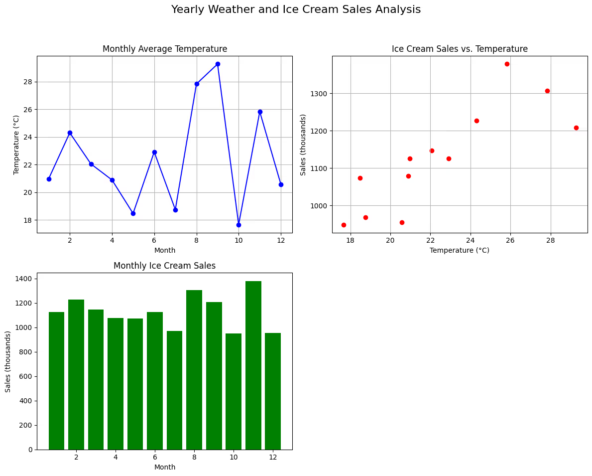
Let's integrate all the discussed components of Matplotlib subplots into a comprehensive example. We'll create a figure with multiple subplots, demonstrating various types of data visualizations and customizations. This example will simulate data for a fictional scenario involving temperature and ice cream sales data over twelve months.
Data Preparation
First, let's define our synthetic dataset:
import numpy as np

# Seed for reproducibility
np.random.seed(0)

# Months of the year
months = np.arange(1, 13)

# Average temperature (in degrees Celsius)
temperature = np.random.uniform(low=10, high=30, size=12)

# Ice cream sales (in thousands)
sales = temperature * 50 + np.random.normal(loc=0, scale=100, size=12)
Creating the Figure and Subplots
Next, we create a figure with a 2x2 grid of subplots:
import matplotlib.pyplot as plt

fig, axs = plt.subplots(2, 2, figsize=(12, 10))

# Flatten the array for easy direct indexing
axs = axs.flatten()
Plotting Data
Now, we'll plot different types of plots in each subplot:
Subplot 1: Line Plot of Temperature
axs[0].plot(months, temperature, marker='o', linestyle='-', color='blue')
axs[0].set_title('Monthly Average Temperature')
axs[0].set_xlabel('Month')
axs[0].set_ylabel('Temperature (°C)')
axs[0].grid(True)
Subplot 2: Scatter Plot of Ice Cream Sales vs. Temperature
axs[1].scatter(temperature, sales, color='red')
axs[1].set_title('Ice Cream Sales vs. Temperature')
axs[1].set_xlabel('Temperature (°C)')
axs[1].set_ylabel('Sales (thousands)')
axs[1].grid(True)
Subplot 3: Bar Chart of Ice Cream Sales
axs[2].bar(months, sales, color='green')
axs[2].set_title('Monthly Ice Cream Sales')
axs[2].set_xlabel('Month')
axs[2].set_ylabel('Sales (thousands)')
Additional Customizations and Clean-up
Let's add an overall title and handle the unused subplot:
# Overall figure title
fig.suptitle('Yearly Weather and Ice Cream Sales Analysis', fontsize=16)

# Hide the 4th subplot (unused)
axs[3].axis('off')

# Adjust layout to prevent overlap
plt.tight_layout(rect=[0, 0.03, 1, 0.95])

# Display the plot
plt.show()
Summary
In this example, we've covered the following concepts:
- Figure and Subplots: We created a figure and arranged multiple plots in a 2x2 grid.
- Axes: We customized each subplot (axes) with different types of plots (line, scatter, and bar plots) to show the relationship between temperature and ice cream sales.
- Axis Labels and Title: Each subplot was customized with appropriate labels for the x and y axes, as well as titles.
- Grid: We added grids to two subplots to improve readability.
- Overall Title: An overall title was added to the figure to provide context to the collection of subplots.
- Layout Adjustment: We used
plt.tight_layout()to adjust the spacing between subplots for a cleaner presentation. - Hiding Subplots: One subplot was hidden because it was unused, demonstrating how to manage extra subplot spaces.
This comprehensive example demonstrates how to use Matplotlib's subplot capabilities to create multi-faceted visualizations, combining various data plots within a single figure for effective data analysis and presentation.
import numpy as np

# Seed for reproducibility
np.random.seed(0)

# Months of the year
months = np.arange(1, 13)

# Average temperature (in degrees Celsius)
temperature = np.random.uniform(low=10, high=30, size=12)

# Ice cream sales (in thousands)
sales = temperature * 50 + np.random.normal(loc=0, scale=100, size=12)
import matplotlib.pyplot as plt

fig, axs = plt.subplots(2, 2, figsize=(12, 10))

# Flatten the array for easy direct indexing
axs = axs.flatten()
axs[0].plot(months, temperature, marker='o', linestyle='-', color='blue')
axs[0].set_title('Monthly Average Temperature')
axs[0].set_xlabel('Month')
axs[0].set_ylabel('Temperature (°C)')
axs[0].grid(True)

axs[1].scatter(temperature, sales, color='red')
axs[1].set_title('Ice Cream Sales vs. Temperature')
axs[1].set_xlabel('Temperature (°C)')
axs[1].set_ylabel('Sales (thousands)')
axs[1].grid(True)

axs[2].bar(months, sales, color='green')
axs[2].set_title('Monthly Ice Cream Sales')
axs[2].set_xlabel('Month')
axs[2].set_ylabel('Sales (thousands)')

# Overall figure title
fig.suptitle('Yearly Weather and Ice Cream Sales Analysis', fontsize=16)

# Hide the 4th subplot (unused)
axs[3].axis('off')

# Adjust layout to prevent overlap
plt.tight_layout(rect=[0, 0.03, 1, 0.95])

# Display the plot
plt.show()
axs.avif)
fig
Creating 3D plots in Matplotlib is an effective way to visualize three-dimensional data. To do this, you'll use the mplot3d toolkit, which extends Matplotlib's capabilities into three dimensions. In this example, we'll create a 3D scatter plot, which is useful for exploring the relationships between three variables.
keyboard_arrow_down
Step 1: Import Necessary Libraries
First, make sure you have the necessary imports:
import matplotlib.pyplot as plt
from mpl_toolkits.mplot3d import Axes3D
import numpy as np
Step 2: Prepare the Data
For this example, let's create some synthetic data that represents measurements in three dimensions:
# Seed for reproducibility
np.random.seed(0)

# Generating synthetic data
x = np.random.standard_normal(100)
y = np.random.standard_normal(100)
z = np.random.standard_normal(100)
Step 3: Create a 3D Scatter Plot
Now, let's set up the figure and axes for a 3D plot and add the data as a scatter plot:
fig = plt.figure(figsize=(10, 7))
ax = fig.add_subplot(111, projection='3d')

# Scatter plot
scatter = ax.scatter(x, y, z, c=z, cmap='viridis', marker='o')

# Customizations
ax.set_title('3D Scatter Plot Example')
ax.set_xlabel('X axis')
ax.set_ylabel('Y axis')
ax.set_zlabel('Z axis')

# Color bar to show the scale of 'z' values
cbar = fig.colorbar(scatter, shrink=0.5, aspect=5)
cbar.set_label('Z value scale')

plt.show()
Explanation of the Steps:
- Figure Creation:
plt.figure()initializes a new figure for plotting. - 3D Axes:
fig.add_subplot(111, projection='3d')adds a subplot to the figure with 3D projection, enabling 3D plotting. - Scatter Plot:
ax.scatter()plots three-dimensional data. Thecparameter colors each point based on its z-value, andcmap='viridis'applies a colormap. - Customizations: Labels for the x, y, and z-axes are set with
set_xlabel(),set_ylabel(), andset_zlabel()methods. A title is also added to the plot. - Color Bar:
fig.colorbar()adds a color bar to the side of the plot, indicating the scale of z-values, with its label set bycbar.set_label().
3D plots like this are powerful tools for visualizing the relationships and structures in datasets that have more than two dimensions. By rotating the plot (which you can do interactively in many environments), you can get a better understanding of the spatial relationships between data points.
import matplotlib.pyplot as plt
from mpl_toolkits.mplot3d import Axes3D
import numpy as np
# Seed for reproducibility
np.random.seed(0)

# Generating synthetic data
x = np.random.standard_normal(100)
y = np.random.standard_normal(100)
z = np.random.standard_normal(100)
fig = plt.figure(figsize=(10, 7))
ax = fig.add_subplot(111, projection='3d')

# Scatter plot
scatter = ax.scatter(x, y, z, c=z, cmap='viridis', marker='o')

# Customizations
ax.set_title('3D Scatter Plot Example')
ax.set_xlabel('X axis')
ax.set_ylabel('Y axis')
ax.set_zlabel('Z axis')

# Color bar to show the scale of 'z' values
cbar = fig.colorbar(scatter, shrink=0.5, aspect=5)
cbar.set_label('Z value scale')

plt.show()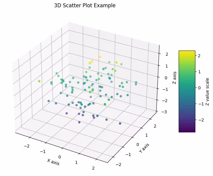
# Python Program to find the area of triangle

a = 5
b = 6
c = 7

# Uncomment below to take inputs from the user
# a = float(input('Enter first side: '))
# b = float(input('Enter second side: '))
# c = float(input('Enter third side: '))

# calculate the semi-perimeter
s = (a + b + c) / 2

# calculate the area
area = (s*(s-a)*(s-b)*(s-c)) ** 0.5
print('The area of the triangle is %0.2f' %area)
.svg)


.avif)
