

Table of Contents
1. Introduction
2. How to choose data visualization tools
a) Ease of use
b) Flexibility
c) Performance
d) Storytelling
e) Scope
f) Pricing
3. Best Data visualization tools
a) PowerBI
b) Tableau
c) QLIK
4. Comparison
a) Deployment
b) Data Connectivity
c) Ease of use
d) Data Visualization
e) Data Transformation
f) Data modelling
g) Data governance
h) AI Capabilities
g) Reporting
h) Mobile experience
i) Pricing
5. The rest of the competition
6. Conclusion
Introduction
Organizations are facing challenges with the rapidly growing amount and variety of data. With the rise of big data and numerous information channels, they need to store, find, access, and share huge amounts of both old and new data. To take advantage of business opportunities, they must be able to combine large and diverse data sources quickly, ideally in real time.
In today's complex data environment, copying data from many sources into one central place is no longer practical because it's expensive and slows down access. While cloud storage has helped, it still creates separate data silos that don't easily connect with other systems, like traditional data warehouses.
Data virtualization is a modern solution for integrating data. It overcomes the limits of older methods by providing a simple, unified, and integrated view of reliable business data in real time or near-real time, as needed by applications, processes, analytics, or business users. It reduces huge amounts of information to simple, intuitive infographics.
How to choose data visualization tools
Ease of use
An intuitive tool, focused on allowing non-technical users is a good starting point.
Flexibility
For more experienced users, the ability to have complete control of configuration, fine-tune the visual design and explore more advanced analytical capabilities can be very useful.
Performance
The amount of data being handled is an important consideration when it comes to the decision of choosing a visualization tool.
Storytelling
While some tools focus on processing data efficiently and having a plethora of graphs a data analyst could understand, some tools focus on conveying a message to the target audience in an intuitive way.
Scope
Some tools offer a wide range of capabilities besides visualization, such as management, modelling and governance. These tools are targeted towards people who are looking for a single solution to all their data needs.
Pricing
Data visualization tools usually have free and paid options. The free options could have different caveats – such as reduced features, performance, data limits , or only be free for public use. Some tools also offer free trials with all the features of the premium product.
The paid options could also have different tiers, depending on the use cases, data usage etc.
Best Data visualization tools
PowerBI
Microsoft’s own business analytics tool designed with visualization in mind, PowerBI is a robust and capable software with a set of features that appeals to the majority of businesses. Microsoft’s familiar user interface in PowerBI makes it simple for anyone who’s used Excel. In addition to being a capable visualization tool, PowerBI is marketed as a Business Intelligence software – as the name suggests. PowerBI can collect, process, analyze, and visualize data to support decision-making processes. As such, it’s the best choice if you’re looking for a Business Intelligence tool and not just a data visualization tool.
Tableau
Tableau has set the standard in the visualization sphere since 2003, when it was launched as the result of a computer science project at Stanford. Since then, Tableau has developed by leaps and bounds. While it doesn’t quite have the market share of PowerBI, the market leader, it is a distant second.
While PowerBI is essentially a business intelligence tool with capable visualization abilities, Tableau is the opposite. It can’t do business intelligence quite as well as PowerBI, but it excels as a visualization tool which has convinced a significant portion of the market to pay a premium for it.
PowerBI may offer superior ETL (Extract, transform and load) abilities, but Tableau certainly makes a solid case for itself.
Tableau’s performance with larger datasets is noticeably better than PowerBI. In addition, despite being intuitive enough for beginners, Tableau’s USP is its utility for advanced analytics. Whether it’s a specialized chart type or a complex dashboard layout, Tableau makes it easy to visualize data in ways that are both impactful and tailored to your requirements. The most notable edge Tableau has over PowerBI is their geospatial abilities.
QLIK
While Tableau and PowerBI are the most well-known tools listed here, it may surprise you to know that QLIK is the oldest. QLIK’s first visualization tool, QLIKView was launched in 1994. While QLIK might not be nearly as famous as Tableau or PowerBI, it is no less capable.
Qlik Sense shares many similarities with both Tableau and PowerBI. More on that later. But Qlik Sense has one thing that sets it apart –
Qlik Sense's associative data model allows users to explore data in a non-linear, intuitive way. Unlike the more structured, query-based approaches of Power BI and Tableau, Qlik Sense enables users to see relationships between data points without predefined queries. This means users can discover hidden insights and patterns that might not be evident in traditional BI tools.
Comparison
Now that you know the three most used visualization tools in the market, let’s see how they stack up to each other:
1. Deployment
PowerBI runs only in Azure – Microsoft’s public cloud computing platform. In comparison, Tableau offers on-premises deployment, public and private cloud facilities through Tableau Online, Virtual Private Clouds – that allow you to deploy Tableau Server on public cloud providers like AWS, Azure and Google cloud with enhanced privacy and security as well as a combination of these. Qlik Sense also offers as much flexibility – offering public and private cloud options with any major cloud provider, Qlik’s own Qlik Cloud as well as hybrid options.
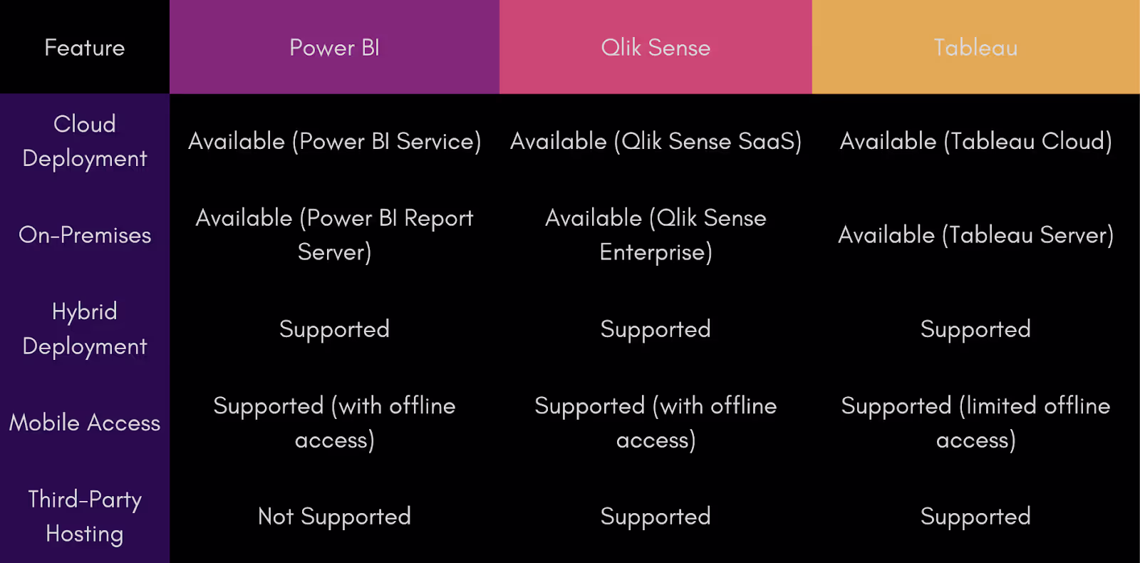
Verdict
Tie between Qlik Cloud and Tableau
Data Connectivity
Power BI users can import data from widely used sources such as SAP, ODBC, Snowflake, and Apache Hive. Additionally, they can utilize Direct Queries to request information directly from the source without importing it. Being such a hugely popular company, Microsoft periodically updates the list of supported connections and with such a big community behind Power BI, all the ones that are currently unavailable have established workarounds.
Qlik Sense offers extensive customization and flexibility, and its native connectors cover most popular data sources that customers might need. For sources not included by default, many can be downloaded from the Qlik website. Additionally, Qlik continuously expands its list of data connections with each new update, so new options are regularly added. However, Qlik lacks support for eCommerce and payment processing platforms.
While Tableau has many connectivity options, it falls short of both Qlik and PowerBI. There are no connectivity options to project management, payment processing, or eCommerce platforms.
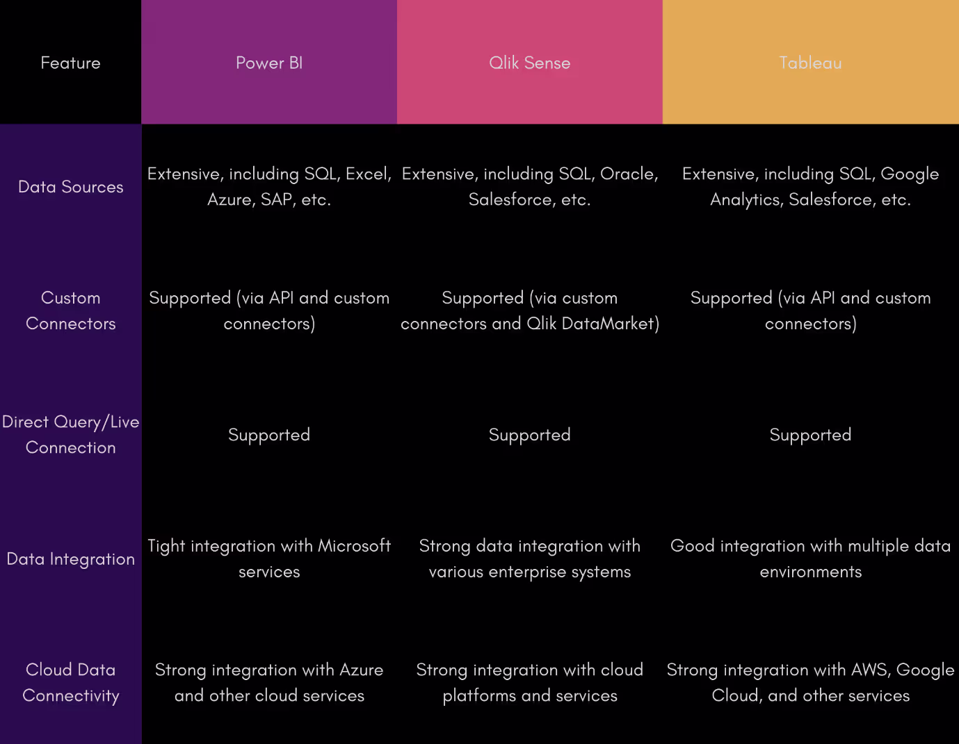
Verdict
1. PowerBI
2. Qlik Sense
3. Tableau
2. Ease of use
PowerBI offers an intuitive drag and drop look with all the tools you’ll need nestled into tabs on the side. The PowerBI interface has a familiar look to anyone who’s used any Microsoft Office product. PowerBI also offers the most templates out of the box, making it easy for beginners to quickly make visualizations. When creating dashboards, you can do it all in one tab without the need for separate tabs as seen with Tableau.
Qlik Sense offers a clearly labelled interface with drag and drop, like PowerBI, however Qlik Sense doesn’t offer a free transform option. This is circumvented by the ability to precisely adjust the size of the grid.
Tableau offers a more minimalistic interface, with a different approach to building charts. In order to create charts, you first need to populate the rows and columns section. However, where Tableau falls short is in the process of building a dashboard. Unlike PowerBI and Qlik Sense, dashboards are only built after making the charts in separate sheets. This makes it a tedious and time-consuming process
Verdict
Tie between PowerBI and Qlik Sense
3. Data Visualization
PowerBI offers a large number of visualizations out of the box , with some generic customization options. In addition , developers have access to the custom visuals marketplace. The marketplace has some new and interesting charts, as well as options to beautify existing charts. However, customization is limited, and users who don’t find their desired options in the marketplace or out of the box will have to resort to coding and packaging their own custom design.
Qlik Sense, similar to PowerBI offers most of the traditional charts and tables out of the box, with a similarly limited level of customization. However, developers will need to rely even more on code to create unique visuals. Qlik does have extensions, but they’re limited compared to PowerBI’s marketplace.
Data visualization is what Tableau does best. The customization levels are the best, and it’s much easier to create unique visualizations and dashboards. Charts can be extended to any size, and can be adjusted to show the full label names.
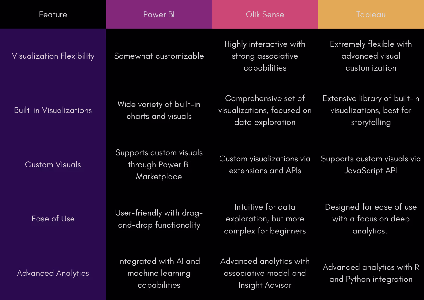
Verdict
For beginners:
1. Tableau
2. PowerBI
3. Qlik Sense
For more advanced coders:
1. Tableau
2. Qlik Sense
3. PowerBI
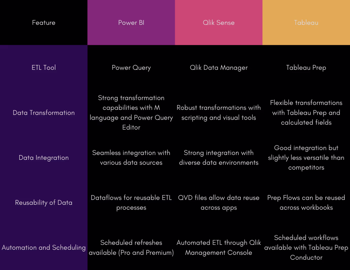
4. Data Transformation
PowerBI shares an ETL tool with Excel – Power Query. The Power Query editor is bundled with PowerBI desktop enabling customers to connect to one or more data sources, then extract, shape, and transform the data to fit their needs, and finally load and use that data in their own models. Power Query editor does pretty much everything you’d need, including an advanced editor to dive into the query code and adjust it to your needs. However, as with Excel, PowerBI doesn’t handle large datasets very well. In addition to performance issues, users may encounter issues connecting to or importing from larger data sets.
Qlik Sense can export raw data in QVD files, designed for use with Qlik. This enables performance that is exponentially faster than other data sources. Using a QVD library enables users to reuse data in other Qlik Sense applications without needing to extract it again. Like PowerBI, users can modify the ETL query code, which uses Qlik Sense script. Qlik’s performance is well optimized and can easily handle large datasets without hassle.
Tableau doesn’t come with built-in ETL functionality, but paid subscribers can utilize Tableau Prep builder, a stand-alone tool that works with Tableau Desktop, Tableau Online and Tableau Server. While the prep builder is user-friendly, there is no option to customize the ETL query code.
Verdict
1. Qlik Sense
2. PowerBI
3. Tableau
Note that these rankings are for the built-in ETL functions, and you could use 3rd party ETL tools depending on your use case
5. Data modelling
PowerBI has all the features you need for data modelling. However, as mentioned before, it struggles with large amounts of data.
Qlik Sense has all the modelling features, and more. The performance is the best of the trio, and with a bonus - the associative engine automatically indexes and connects all data relationships.
Tableau has the most tedious data modelling process of the three. Users can't import all tables at once and adjust connections on the fly; instead, they must drag them in one by one in the correct order, or risk starting over. Additionally, users must manually define the connections, and with no table preview available, the process becomes more tedious and cumbersome.
Verdict
For large datasets
1. Qlik Sense
2. Tableau
3. PowerBI
For smaller datasets
1. Qlik Sense
2. PowerBI
3. Tableau
6. Data governance
Power BI offers a range of data governance features that help organizations ensure data accuracy, security, compliance, and consistency across their reports and dashboards. Users can leverage features like endorsing datasets to highlight those that are important for their team, even marking them as certified for added authority.
PowerBI also has sensitivity labels for dashboards, reports, data sets, and even data flows, which can then be used to control access between your userbase.
Qlik Sense includes built-in functionality called Section Access, which controls data visibility by dynamically adjusting what data is shown based on the user accessing the application. This setup is managed within the app’s data load script to ensure users see only the relevant data.
In addition, every Qlik Sense customer has access to their own Qlik Management Console (QMC). The QMC allows for extensive customization, including setting up tags, configuring security rules, and managing access to streams (or spaces). Although it can be complex initially, it provides powerful options to tailor the Qlik Sense experience to meet specific organizational needs.
Tableau focuses heavily on providing users with the flexibility to control data access through various authentication and authorization mechanisms. This includes features like user filters and metadata management.
Additionally, users can monitor and audit the usage of their workbooks and dashboards to ensure data assets are used as intended. Tableau also supports integration with other security protocols such as Kerberos, Active Directory, SAML, trusted tickets, and certificates.
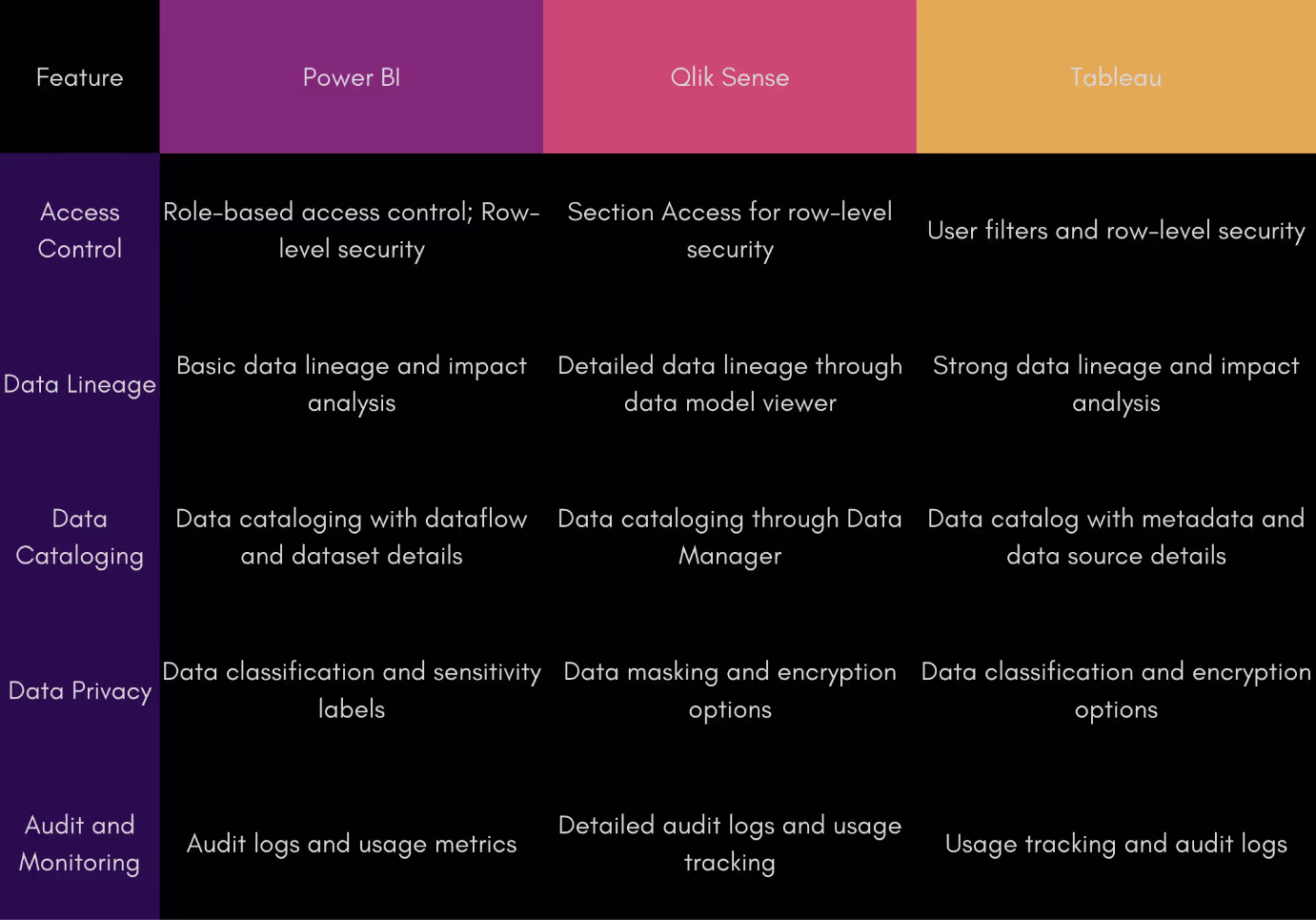
Verdict
3-way tie
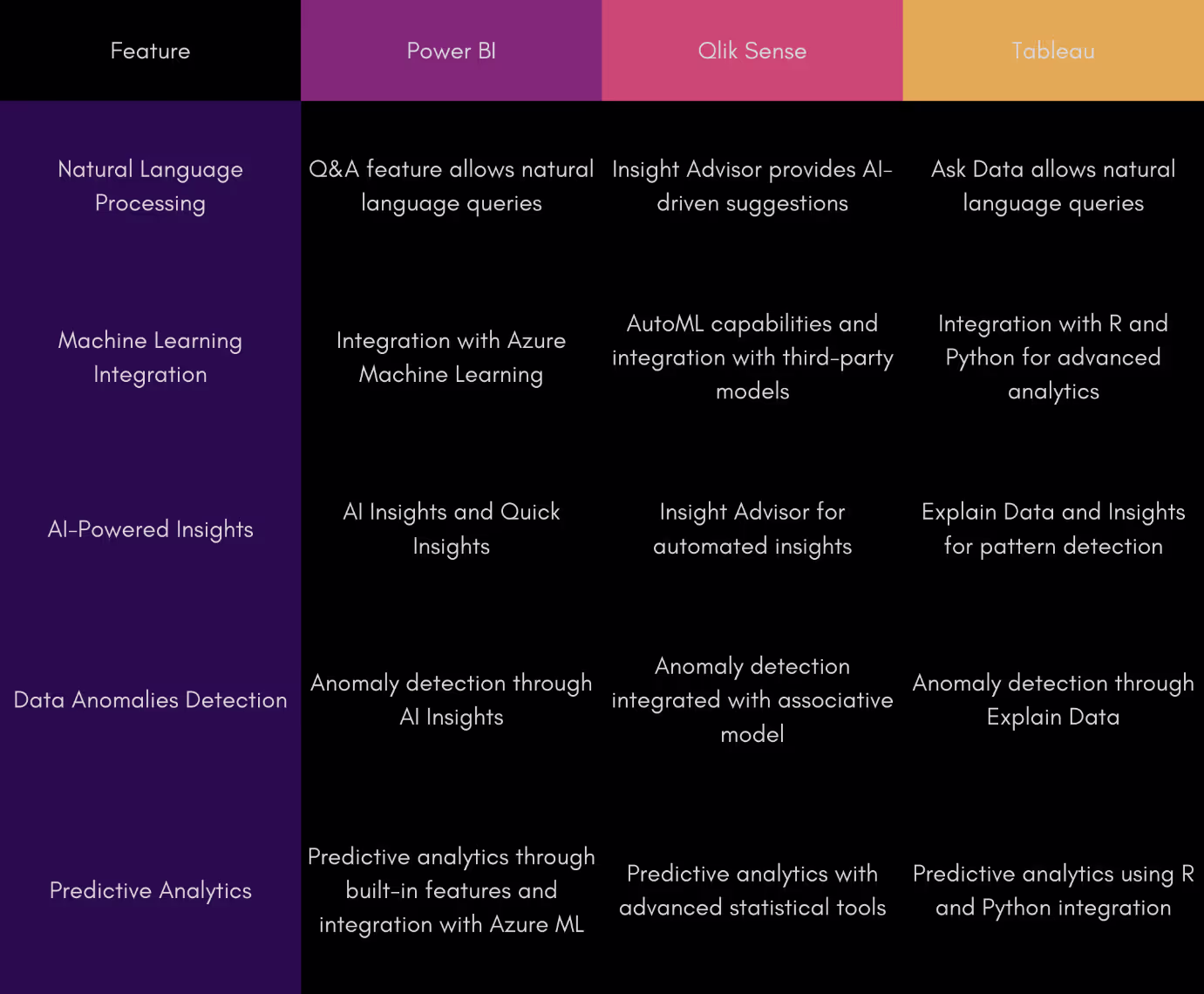
7. AI Capabilities
Power BI’s augmented analytics features leverage AI to enhance data analysis and insights. The platform includes Cognitive Services that automatically generate insights, detect patterns, and provide explanations for data trends. Q&A functionality allows users to ask natural language questions and receive instant answers and visualizations. Quick Insights can automatically scan data and surface key trends and anomalies. Additionally, Power BI's integration with Azure Machine Learning lets users apply advanced analytics models directly within their reports. Azure ML can both create new machine learning models and import existing ones from platforms such as PyTorch, TensorFlow, or scikit-learn.
Qlik Sense’s focus on speed and efficiency has driven enhancements in preparation, exploration, and authoring functions through associative suggestions. This improved performance is powered by their Associative Engine, which assists users of all skill levels in searching for insights and correlations within their data sets.
Additionally, with the required subscription, users can leverage the Insight Advisor to accelerate data preparation and analysis using natural language inputs.
Like PowerBI, Qlik Sense also utilizes automated machine learning (Qlik Auto ML), however this requires a separate license. With it, users can effortlessly create machine learning models, make predictions, and test scenarios with minimal or no interaction with the underlying code.
However, Qlik provides no inbuilt way to incorporate any ML models developed elsewhere without using extensions and workarounds.
Tableau’s no-code approach continues here. With their own tools such as their insight advisor and their “Explain data” feature which shows users relevant data when hovering over particular highlight points, Tableau provides a beginner-friendly AI experience. Like PowerBI and Qlik, Tableau has integrated its own Auto ML feature, the Einstein Discovery no-code environment, which requires a separate subscription.
Verdict
1. PowerBI
2. Qlik Sense
3. Tableau
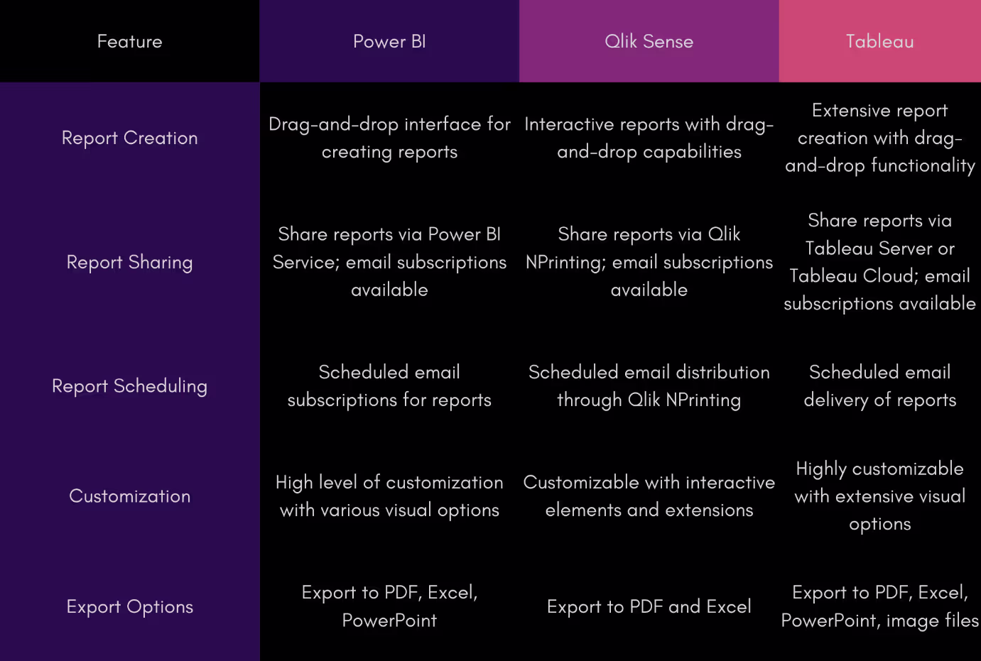
8. Reporting
Power BI offers built-in functionality for report sharing and delivery, but the integration between the desktop and online versions is somewhat disjointed. Users can upload reports created in Power BI Desktop to the online platform, where they can set up scheduled email subscriptions with role-based data access controls. However, the online version provides more comprehensive control over report adjustments and distribution, as the desktop version has limited capabilities in this area.
Additionally, reports can only be sent as email attachments in various formats like PPTX, PDF, and XLSX. In summary, while Microsoft provides basic reporting features, the overall process for seamless report sharing and delivery across Power BI’s desktop and online platforms could be more cohesive.
Many PowerBI users have resorted to using Power Automate, which requires a separate subscription if you don’t have a Microsoft 365 Suite subscription.
Qlik Sense does not include built-in report distribution and sharing features initially; instead, it requires a separate subscription to the Qlik NPrinting platform. However, Qlik NPrinting is highly functional and customizable.
With Qlik NPrinting, users can schedule email distributions, targeting different roles or positions with various types of reports. Reports can pull data from multiple apps, and users can customize and filter the data extensively. Reports can be sent as attachments or embedded directly within the email message body.
Like Power BI, Tableau has some built-in reporting features called site subscriptions. To use these, a server administrator needs to enable them, and the email report recipients must have at least a Viewer license. Users can set up scheduled email reports to be sent as images or PDF files.
However, it's important to note that Tableau doesn’t offer advanced options for creating or customizing reports. It simply allows you to share and distribute regular dashboards as reports, which is fairly basic.
Verdict
1. PowerBI
2. Qlik Sense
3. Tableau
9. Mobile experience
Power BI’s mobile app works on Android and iOS phones and tablets, as well as Windows phones. It lets users view their reports and dashboards in real-time with an easy-to-use interface.
Users can also use the Q&A feature to find new insights by typing or speaking naturally. The app supports collaboration through comments, @mentions, and annotations. However, users cannot develop new visualizations and dashboards on the go.
Qlik Sense’s mobile app works only on Android and iOS devices, so it’s not available for Windows phones. However, users can view, analyze, and create dashboards and visualizations using the app.
The mobile interface makes it easy to collaborate on projects, set up alerts, and find insights with the Insight Advisor Chat Bot. Dashboards created on the mobile app can smoothly transition across different devices. Plus, users can download apps and data for offline use, which is helpful in areas with unreliable internet.
Like Qlik Sense, Tableau mobile only works with Android and iOS. Unfortunately, you cannot create visualizations or dashboards, only view them. Tableau also doesn’t have any collaboration options, though users can share contents directly with others. Tableau does offer partial offline support allowing users to preview required data at all times, regardless of internet support.
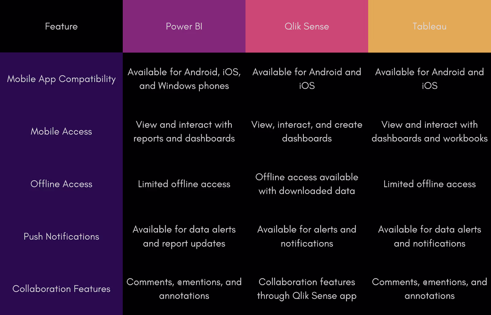
Verdict
- Qlik Sense
- Tie between PowerBI and Tableau
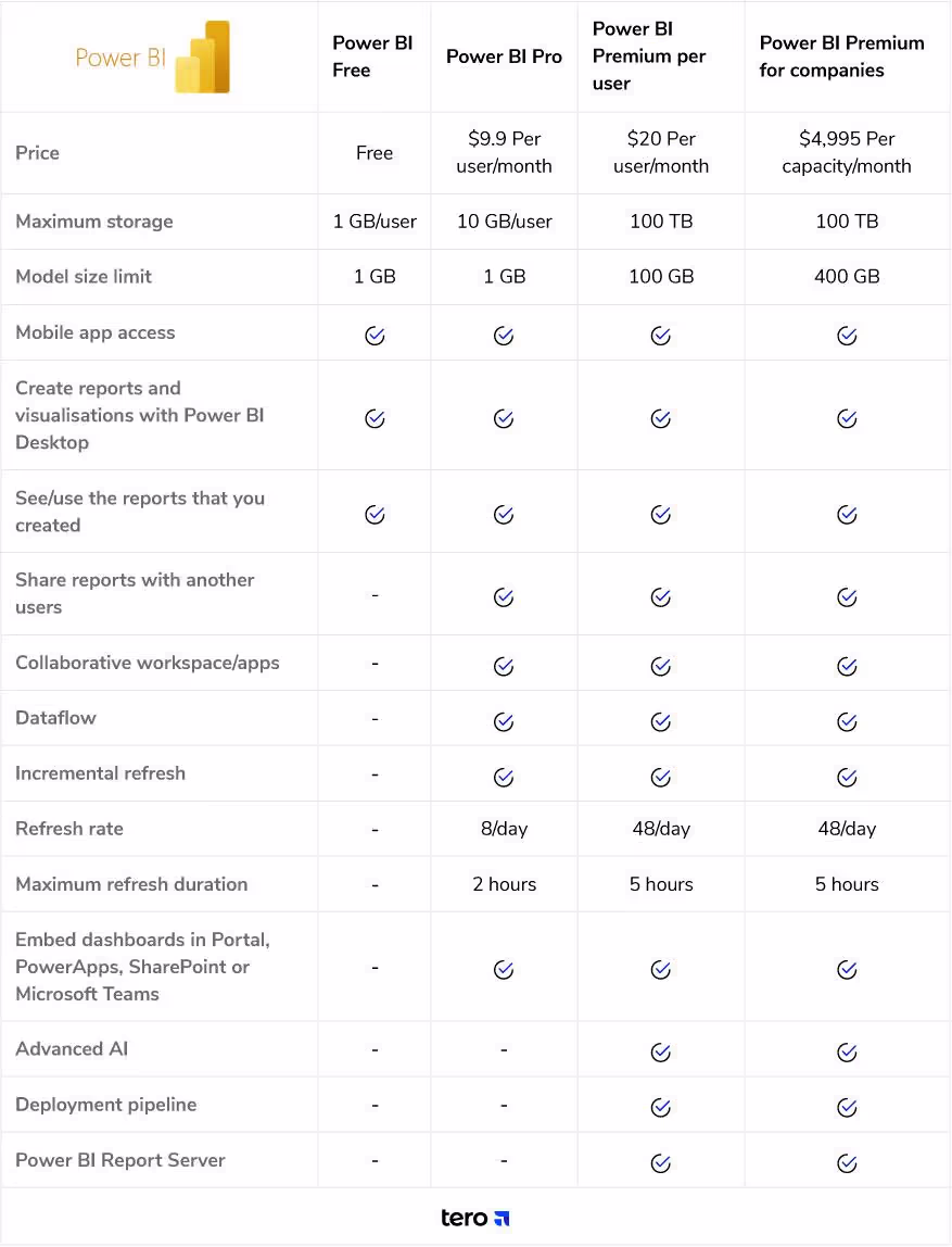
10. Pricing
Microsoft offers two Power BI options: Power BI Pro and Power BI Premium. Power BI Pro has some limitations, while Power BI Premium offers more advanced features. Users can try Power BI for free by downloading the Power BI Desktop application, which allows for personal report and dashboard creation but has limited data source connections. To unlock features like data sharing and collaboration, users need a Power BI Pro license, priced at $15 per user per month.
For access to more advanced features such as Dataflows, advanced AI capabilities, and paginated reports, users can opt for Power BI Premium at $29.9 per user per month. These pricing options are suitable for companies with fewer than 100 employees, but larger organizations may need to contact Microsoft for a custom pricing plan.
Qlik Sense does not have a free version, though it does offer a free trial . Taken from the website, here’s a comparison of the various Qlik tiers
Qlik's pricing for the Qlik Sense Business license is designed to get users started quickly, costing $30 per user per month. This plan includes most of Qlik Sense’s features but has some limitations, such as app size and the number of shared spaces a user can access. Clients can explore and test this cloud-based version with a 30-day free trial if they're unsure about the cost.
While this option is ideal for small businesses, larger companies might benefit more from requesting a custom quote from Qlik’s sales team.
Tableau in comparison has several options depending on use cases.
Tableau Viewer costs $15 per user per month on Tableau Cloud, or $12 on Tableau Server. It's meant for users who just need to view and interact with data, not create it. If you want to create content, you’ll need the Tableau Explorer license, which costs $42 on Cloud or $35 on Server. It has some limitations, but it’s enough to get started.
Most companies will likely choose the Tableau Creator license, which is the most expensive at $75 per user per month. This license gives full access to Tableau Desktop, Tableau Prep Builder, and either Cloud or Server, making it the most complete version. There’s also a free 14-day trial to try out everything.
In summary, Tableau gives users flexible license options, but it's the priciest tool compared to others.

Qlik Sense’s pricing tiers

Verdict
1. PowerBI
2. Qlik Sense
3. Tableau
The rest of the competition
ThoughtSpot
ThoughtSpot focuses on providing easy-to-use, AI-driven analytics. Its drag-and-drop interface makes it simple for anyone to analyze data quickly. With tools like Search IQ and Spot IQ, users can uncover hidden data insights. There's a 30-day free trial for those who want to give it a try.
Sisense
Sisense offers a user-friendly drag-and-drop interface for analyzing, visualizing, and sharing data. It includes standard features like dashboard creation, data mashups, and augmented analytics. They also offer a two-month free trial to see how it stacks up against other tools.
Oracle
Oracle Analytics is a comprehensive AI-driven analytics tool, covering everything from data preparation to visualization. With Oracle’s strong background in database management, it offers sophisticated data preparation and visualization features. You can try it out with a 30-day free trial.
SAP
SAP Analytics Cloud (SAC) combines planning, data visualization, and predictive analytics in one tool. It integrates other SAP tools to streamline company analytics processes. With machine learning and augmented analytics, it helps users find valuable insights. A 30-day free trial is available, extendable to 90 days after the first week.
Domo
Domo is a cloud-based BI platform designed for business users. It’s fast, transparent, and easy to use, with customizable data connections, dashboards, and alerts. Its Magic ETL feature simplifies query handling with a drag-and-drop interface. Domo also offers a 30-day free trial to test its features.
Looker Studio
Google’s Looker Studio offers a powerful, user-friendly platform for data exploration and visualization. It allows users to create custom dashboards and reports, pulling data from multiple sources for a comprehensive view. With its robust data modeling capabilities, Looker Studio helps users derive deeper insights. A free trial is available for those who want to explore its features.
Conclusion
Each of Tableau, PowerBI and Qlik Sense make a compelling case for themselves. The right choice depends on your use cases and needs, and of course, budget.
Tableau is ideal for users who need advanced data visualization capabilities and have experience with data analytics. It’s great for businesses focused on in-depth, visual data exploration and those who require flexible deployment options.
Best suited for organizations already within the Microsoft ecosystem, such as those using Office 365. It's user-friendly for beginners and powerful enough for advanced users, making it a good fit for a wide range of business sizes. The most reasonably priced of the lot, for most users, PowerBI covers the most bases for the money, making it a straightforward business decision, at least initially.
Qlik Sense is designed for users who need strong data discovery and self-service analytics. Its associative data model is perfect for exploring complex data relationships, making it ideal for businesses that prioritize data exploration and interactivity.
For a free data visualization tool though, you will need to look away from Qlik. Both PowerBI and Tableau provide a robust free experience.
If you’re looking beyond just visualizations, check out our article on the best Business Analytics Software for 2024.
To learn more about business intelligence, we have that covered in our guide to How Business Intelligence Can Transform Your Business Operations.


.avif)
