I. Introduction
In today's data-driven world, simply collecting information isn’t enough—communicating it effectively is critical. This is where data visualisation comes in. Turning complex data into clear, visual insights makes patterns, trends, and relationships easier to understand. In this article, we’ll explore the data visualisation techniques and principles, showing you how to create visuals that look good, tell a meaningful story, and support informed decision-making. Whether you're working with charts, graph visualisations, or infographics, understanding these principles will help you make the most of your data.
II. Why Data Visualisation?
Data visualisation is vital for several reasons:
- Simplifying complex data: Data visualisation transforms large or complicated data sets into clear, easy-to-understand visuals, helping users quickly grasp vital insights.
- Identifying patterns and trends: Visuals such as graphs or heatmaps make it easier to spot patterns, trends, and anomalies in data, which may not be immediately apparent in raw numbers.
- Better communication: Good visuals convey the message more clearly, making sharing data with different people easier.
- Helping with decision-making: Visualised data gives decision-makers a clear view, making it easier to make the right choices.
- Showing relationships: Visuals can highlight connections between different data points, helping you understand what's driving outcomes.
- Telling a story: Data visualisation makes building a story around your data easier, making it more engaging and interesting for your audience.
- Making data accessible: Visuals help people without a technical background understand and make sense of the data.
- Data integration: Data visualisation is great for bringing together information from different places, including those tricky data silos. When data is scattered across various departments or systems, it can be hard to get a clear, complete picture. Using visualisation tools, you can pull all that data into one place and create visuals showing how everything connects.
III. Traits of an exemplary data visualisation
There are three essential principles of good data visualisation
- Useful: People should be able to access all the information they need in as little space as possible.
- Desirable: A data visualisation should leave the user with an overall positive impression. Ṅ
- Usable: Most importantly, people who use it should be able to accomplish their goals quickly and easily.
However, for a truly excellent data visualisation, we need to go above and beyond the basics:
- Visually appealing: With a host of more sophisticated data visualisation tools, the bar is set very high. Old technology and dated graphics don’t cut it anymore.
- Scalability: If your data visualisation is well done, people will be eager to use it. Make sure you create it on a system that's scalable, so it’s easy to access and update as needed in the future.
- Focus: It’s an issue if users get fixated on the visual or a specific feature instead of focusing on their actual needs. Before making a visualisation, be clear about its purpose—whether it’s for self-service, detailed analysis, drilling down into data, or giving an executive summary.
- Accessibility: An accessible visualisation is user-friendly and easily adjustable when needed. Additionally, the data should be reachable from any device, anytime, anywhere. This is crucial for ensuring that users adopt and make the most of it.
- Rapid development and deployment: The days of lengthy waterfall projects and drawn-out data visualisation deployments are over. Users expect their information quickly, and if you can't deliver it in a timely manner, they'll look for other sources.
IV. Principles of Effective Data Visualisation
Now that you have a birds-eye view of what makes a good data viz, let’s get down to the main points.
1. Picking the right content type
Visualisations are far more than text and numbers arranged in tables. When creating a visualisation, not only should it be attractive, but it should also match the data you have and what you want to get out of it. Selecting the right visualisation is the first thing you should do. Here are some content types to consider:
Charts that show changes over time
Charts that show changes over time are excellent for tracking trends and understanding how data evolves. Here are some common types:
- Line Chart
- Area Chart
- Column Chart
- Bar Chart
- Gantt Chart
- Sparklines
Charts that show part-to-whole composition
Charts that show part-to-whole composition are helpful in illustrating how different parts contribute to a whole. Here are some common types:
- Pie chart
- Donut chart
- Stacked bar chart
- Stacked column chart
- Tree Maps
- 100% stacked column/bar chart
Charts that show how data is distributed
Charts for looking at how data is distributed help you understand the spread and frequency of data points within different ranges or categories. Here’s an overview of common types:
- Bar charts
- Histograms
- Box plots
- Violin plots
- Density plots
- Scatter plots
Charts that compare values between groups
Another common use of data visualisation is comparing values across distinct groups. This is often combined with other purposes, such as tracking changes over time or analysing how data is distributed. Here are the common types used for this purpose:
- Bar charts
- Column charts
- Stacked bar/column charts
- Pie charts
- Donut chart
- Bubble charts
- Box plots
- Heatmaps
Charts that observe relationships between variables
Charts for observing relationships between variables help you identify correlations, trends, and interactions between different data points. Here’s an overview of common chart types used for this purpose:
- Scatter plots
- Bubble charts
- Heatmaps
Charts for looking at geographical data
Sometimes, data includes geographical information, such as latitude and longitude or regions like countries and states. While you can extend an existing visualisation by overlaying it on a map (e.g., plotting points like in a scatter plot over a map), there are other chart types specifically designed to account for geographical contexts.

2. Choosing the right tool
Not all tools are created equal. Committing to a tool before understanding what needs to be visualised can lead to failure. If your company has already chosen a specific tool, you’ll need to work within its constraints. However, if you have the flexibility to choose, let the data guide your decision on which tool to use. The three most popular tools for interactive data visualisation are:
- Tableau
- PowerBI
- QlikSense/QlikView
If you want a lowdown on the differences between the three, check out our article on the Top Data Visualisation Tools for 2024: A Comprehensive Guide, but in short, here are the factors you need to consider before choosing a tool:
- Type of data
- Visualisation capabilities
- Ease of use
- Customization
- Integration with data sources
- Scalability
- Collaboration features
- Interactivity
- Performance and speed
- Pricing
- Cross-platform accessibility
- Security and compliance
- Support and community
V. Common Data visualisation mistakes
You have already learned about what makes a good viz, but it’s equally important to know what to avoid:
1. Misleading colour contrast
Too much colour can confuse users who are interpreting quantitative data.

What to do instead:
- Use a limited number of colours to differentiate categories. Using too many overwhelms the viewer
- For each category, ideally choose darker and lighter shades for the same colour to illustrate the difference in numbers
- Apply colours consistently throughout the visualisation to represent the same categories or values.

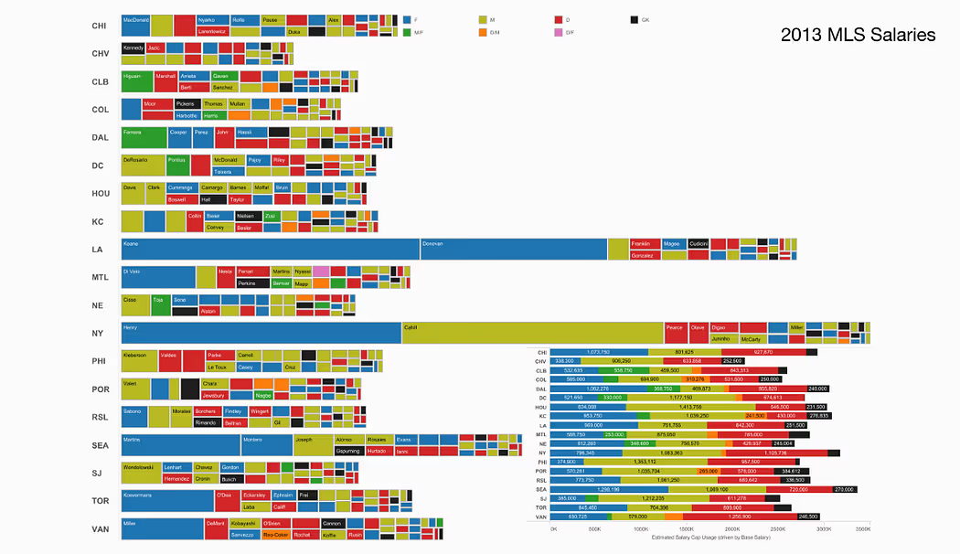
2. Too much data
While it’s always a good idea to see everything you need in a single screen, but having too much data to show it all at once might cause the audience to get overwhelmed.
What to do instead:
- Start by determining only what users need to focus on so you can limit the data to only those most relevant to the message you want to convey.
- Do not put all your data into a single chart. Use dashboards with multiple visualisations instead.
- Avoid using more than 5-6 colours on a visualisation.
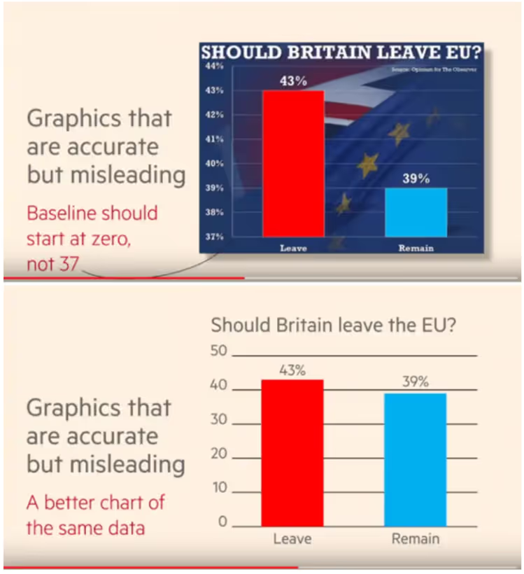
3. Omitting baseline and truncating scale
This data visualisation problem is widespread in politics and sports, and it might indicate false patterns or even trends that do not exist.
What to do instead:
- Try using a zero-baseline y-axis whenever possible.
- There are times when NOT starting from zero is acceptable or even desirable. There are two main situations:some text
- When the data is targeted at people who understand that the Y axis doesn’t start from zero and understand the implications of it.
- When tiny changes in the metric are significant.
4. Improper use of 3D graphics
The use of 3D in data visualisation is a contentious issue. Most 3D charts are rarely used for displaying standard data anymore, as they carry a high risk of misrepresenting information due to our eyes' difficulty in accurately interpreting 3D visuals.
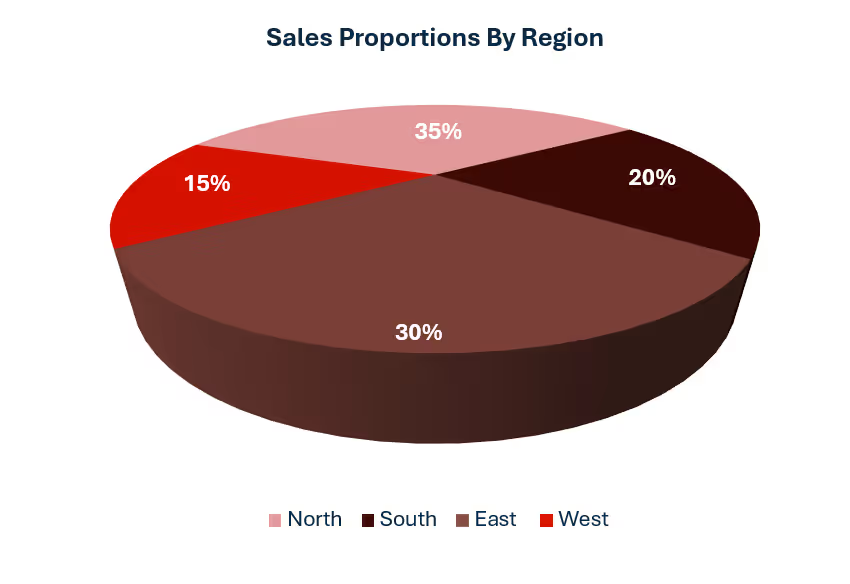
The above pie chart, for example, makes the rear half appear bigger than the front half despite the actual values being 30% versus 35%. The human brain has difficulty comprehending a 3D graph in a 2D medium, which is their screen.
What to do instead:
- Use 2D as much as possible
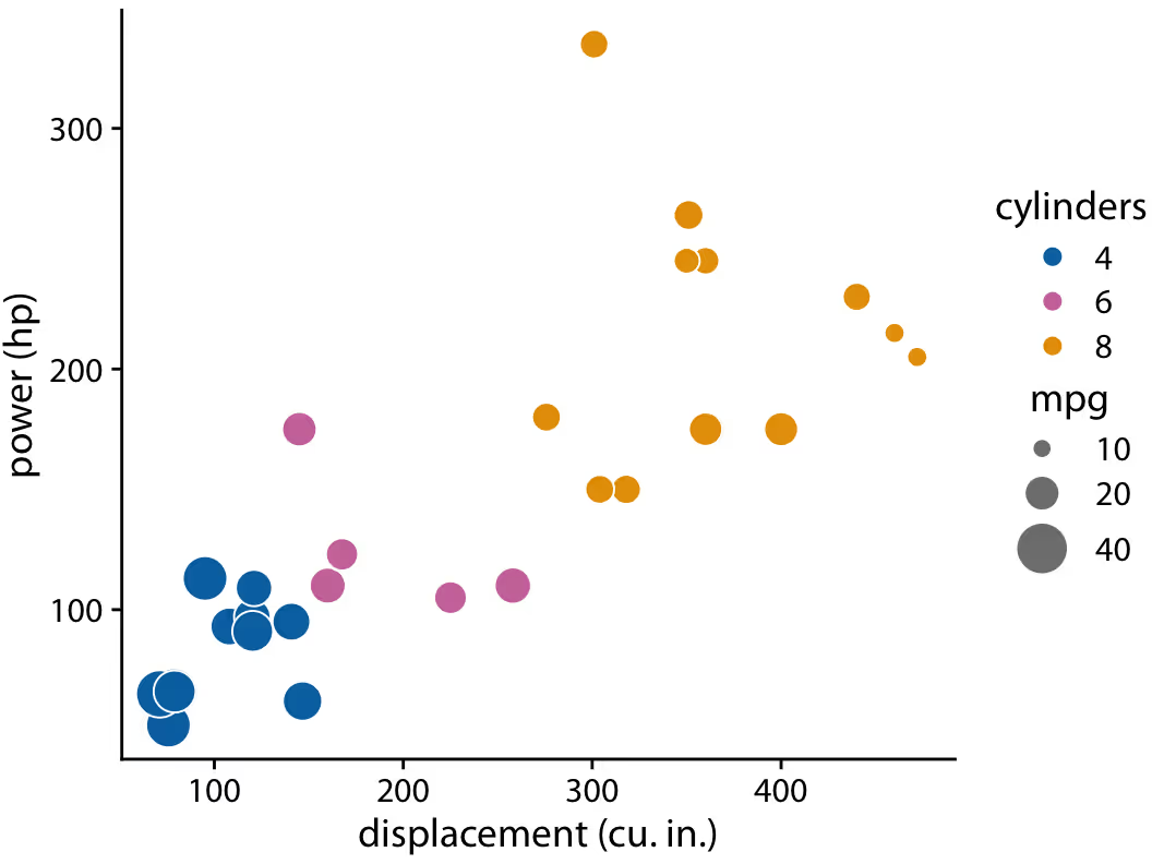
- When there are three axes, use certain visualisations, such as bubble plots.
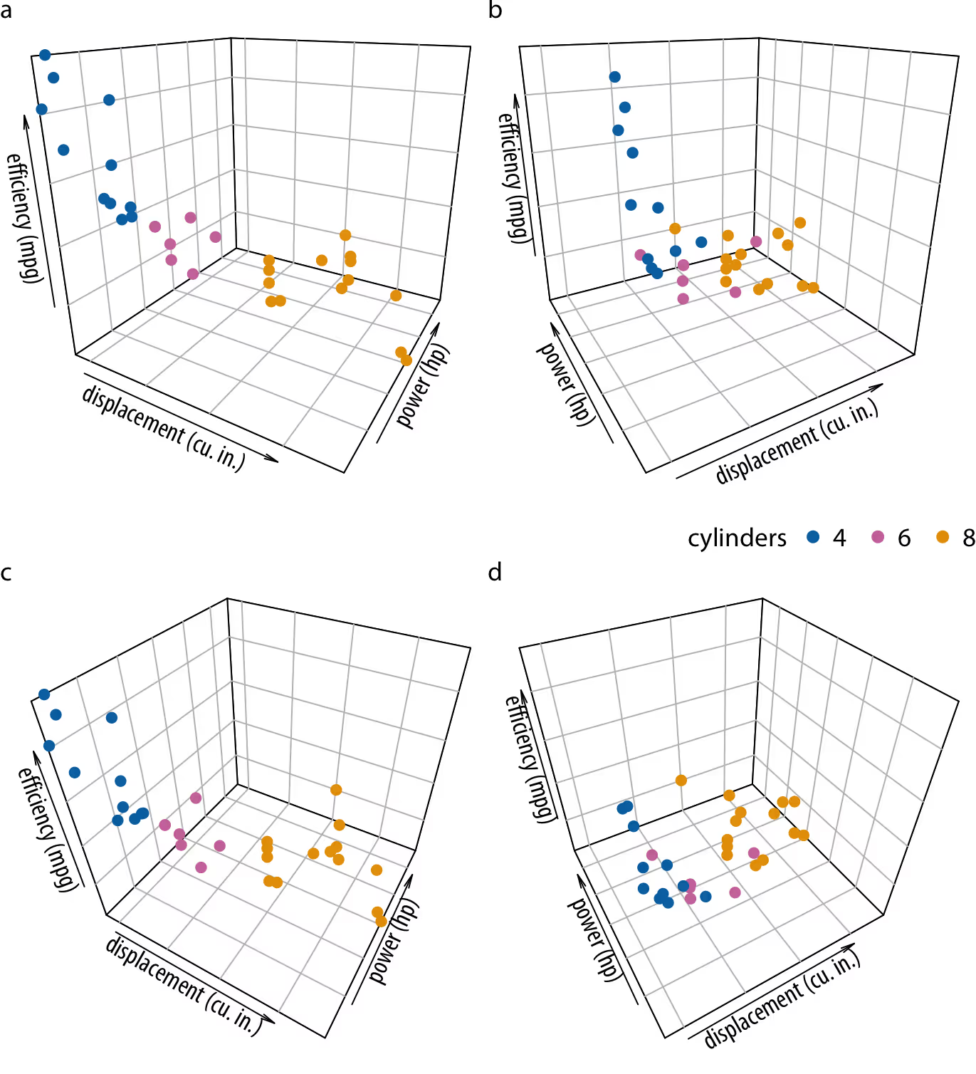
The 3D graph above is complex for the human eye to interpret. However, the data can be interpreted much more efficiently using the bubble chart below:
VI. Bonus tips: Going the extra mile
1. Use contextual shapes and designs
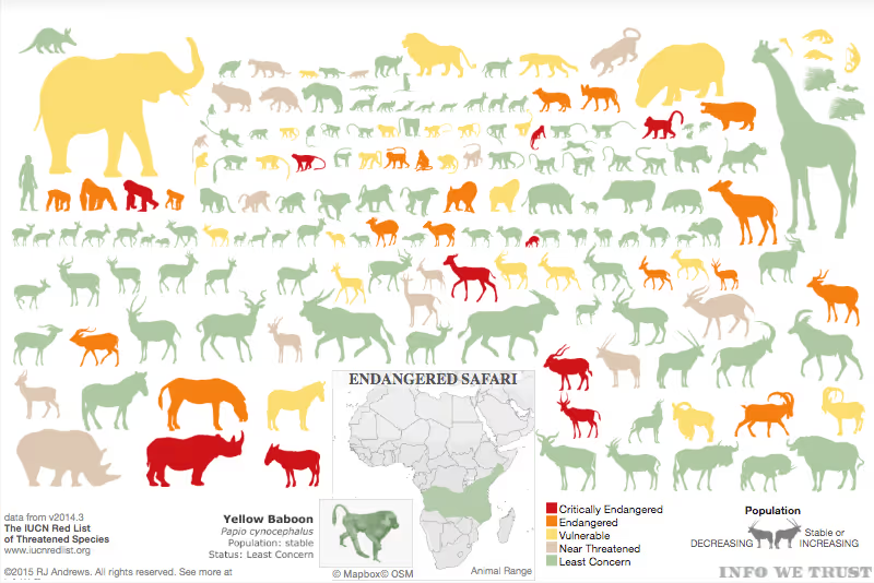
Context helps us decipher information at first glance instead of sitting and scrutinising it. Subject matter shapes can tell a compelling story. For instance, the chart above on endangered species in Africa gives us an immediate overview of which animals are endangered and how vulnerable they are. Instead of using traditional bar charts with values, where each animal is reduced to numbers and text that can make the data and viewer feel disconnected, using animal silhouettes makes the information much more engaging and intuitive.
2. Use size to visualise values strategically
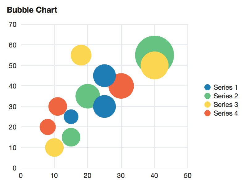
We’ve already seen an example with a bubble chart using the size of the bubbles as an extra dimension. Size can highlight important info and give additional context. In the earlier visual, the endangered animal shapes reflect how big the animals are compared to each other. But size can also represent scaled values. Instead of using just colour, you can adjust the size of shapes based on the data. This works great with maps, too. When all the data points are the same size, it’s hard to tell them apart. Making the size relative to the value and adding colour as a second marker makes the visual much easier to read, like in this example.
3. Use text to your advantage
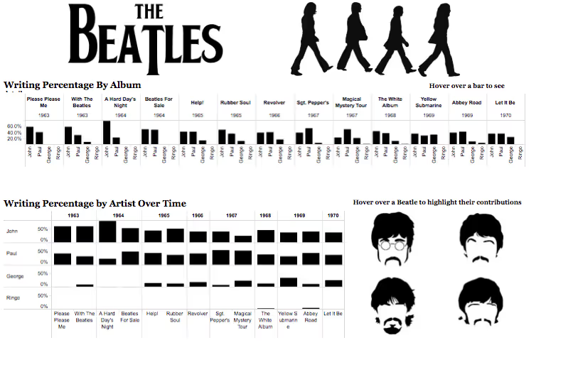
The text you choose can enhance your visualisations, whether it's the type of text or how much you use. Too much or poorly organised text can be distracting, but sometimes visuals alone just aren't enough. When using text, make sure it highlights key points—like showing the individual contributions of Beatles members to their hit songs and albums. Even though we naturally process images and patterns better than words, adding text where it matters can make a significant impact. Here are some other tips to take your visualisations from good to great:
- Put the most important part at the top or upper left corner, where your eye goes first.
- Stick to three or four views in your visualisation. Too many, and the overall message gets lost in the details.
- If you have multiple filters, group them together and maybe add a light border to show they’re related.
- Interactivity can make or break a visualisation. It helps tell the story and invites exploration. If you add interactive elements, ensure viewers know they can engage with them—maybe by adding a little instruction.
VII. Dashboard tips
1. Know your audience
The most effective dashboards are designed with their target audience in mind; this doesn’t happen by chance. Consider who you are planning for. Is it a busy salesperson with just 15 seconds to check key performance indicators or a team analysing quarterly dashboards over a few hours? It's crucial to understand the audience’s level of familiarity with the subject and the data. For instance, a beginner may need more action-oriented labels for filters or parameters than a more advanced user. If you’re unsure about your audience, begin by asking questions about their priorities and how they interact with data, which will help you determine the best way to present the information. Keep in mind that you can always create additional dashboards. Starting simple is often the best strategy.
2. Consider display size
Your target audience may use mobiles rather than desktops. When designing a dashboard for smaller screens, make sure that only the most important KPIs are on the surface. Use elements that are easy to click and have limited, intentional interactivity.
For mobile screens, it is ideal to stack dashboards vertically.
3. Plan for fast load times
Even the prettiest dashboard won’t matter if it takes ages to load. Slow load times can come from your data, the dashboard itself, or a mix of both. Some of the most critical choices you make as a creator actually happen in the data prep stage before you even build the first view. Where you can, especially with production views, do your calculations in the database to cut down on the workload. Aggregated calculations work well in Tableau for calculated fields, but for row-level stuff, it's better to handle that in the database. Think about whether you need to limit the amount of data shown in your dashboard—filters on the data source or creating extracts can help with that. Extracts usually load much faster than live data and are fantastic for testing things out, but they’re not always a long-term fix. If your data is constantly being updated, a live connection might make more sense for the final version.
4. Leverage the sweet spot
Understanding the “flow” of how humans view dashboards can truly differentiate between a good dashboard and a great one. Your dashboard should have a clear “flow” and a logical arrangement of information. As you design, think about how different elements form natural groups and arrange them accordingly. Use shading, lines, white space, and colour to highlight these connections.
Viewers used to left-to-right script instinctively scan the top left corner. Once you’re clear on your dashboard’s primary purpose, make sure to position your most important view in the upper-left corner, where it will stand out or span across that area.
There are a few layout patterns that can help align with how people typically scan or read designs. Two of the most common are the F-pattern and the Z-pattern layouts.
The F-pattern is the most widely used eye-scanning pattern, especially for dashboards with lots of text. The Z-pattern layout, on the other hand, works well for dashboards with less text. It follows a natural reading path where the eyes move from left to right, zigzagging down the page.
5. Avoid meaningless variety
This applies in several ways:
Too many types of charts: Remember to limit the number of charts as much as possible. It is absolutely fine to repeat a chart any number of times so long as it’s the best choice to represent the data. This reduces the time and energy needed for interpretation.
Too many colours: Using colour wisely can really boost your analysis. But if you use too many colours, it can overwhelm your audience, slow down their analysis, and sometimes even stop it altogether.

A dashboard with too many colours
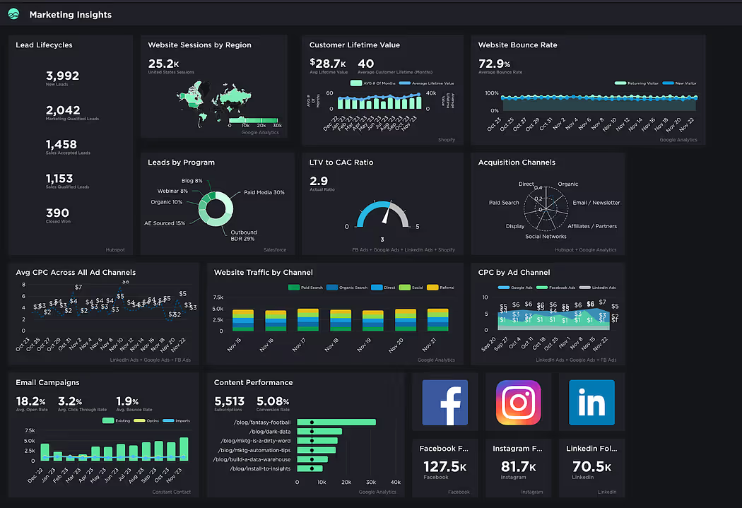
A dashboard using a cohesive blue-green colour scheme
Too many views:
It’s easy to get carried away and want to stuff your dashboard with every possible view, but too many can make the big picture hard to see. Stick to two or three key views. If you need more, try making additional dashboards or using a series of visuals that work together to guide your audience through the info.
Too many distractions: A dashboard’s cosmetic design should emphasise the data, not distract from it.
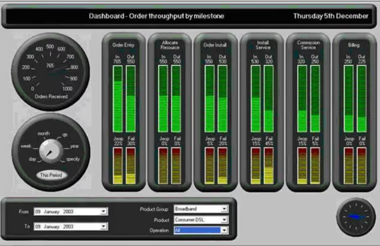
The designer took the word "dashboard" literally
Other effects to avoid include:
- Gradients/textures
- Shadows / glows
- 3D effects
- Heavy grids
- Box outlines
- Background tints
6. Make it interactive
Dashboards are powerful, too, well beyond a simple collection of infographics. The ability to interact with the dashboard is something you should leverage as much as possible. Here are some ways to do it:
- Filters and Dropdowns: Let users pick what they want to see by adding filters or dropdown menus. This way, they can drill down into specific data or switch between different views easily.
- Hover Effects: Add hover effects to reveal more details when users mouse over certain parts of your dashboard. It’s a neat way to give extra info without cluttering the main view.
- Clickable Elements: Make charts and graphs clickable so users can dive deeper into specific data points. For example, clicking on a bar in a bar chart could show more detailed data about that category.
- Sliders: Use sliders to let users adjust time frames or other variables. This helps them see how data changes over time or with different settings.
- Drill-Downs: Allow users to click on a summary view to “drill down” into more detailed information. It’s like starting with a broad overview and then getting into the nitty-gritty as needed.
- Search Boxes: Add a search function so users can quickly find specific data or terms without scrolling through everything.
- Dynamic Charts: Let charts update in real time as users adjust filters or selections. This keeps the data relevant and current.
By adding these interactive elements, you make your dashboard more engaging and helpful, letting users explore the data in ways that best suit their needs.
7. Go from overview to details
It’s always good practice to start with the birds-eye view of the data, and let the viewer “drill-down” whenever required. Using interactivity features is a good way to do this. Too many details or measures that are expressed too precisely will just slow the viewers down without providing any benefits.
Supplement this by rounding up or down when necessary, including thousand separators and adjusting decimal places (ideally 1 or 2). When looking for a suitable format, check the maximum and minimum values (if they are not outliers) and adjust the precision to provide a meaningful comparison.
8. Create a visual hierarchy
First, decide the order of importance of the data, then create a visual hierarchy. This will add emphasis to the important aspects of the dashboard. Here are some useful methods you can incorporate:
- Add the most important visuals to the top left of the dashboard. Use the F or Z pattern to decide how to proceed from there.
- Use size and scale. Larger elements attract more attention. Use size to highlight the most important data points or categories.
- Use colour and contrast to draw attention to important elements.
- Use varying text sizes and weights to establish a hierarchy in titles, subtitles, and body text.
- Visual elements such as lines, borders, whitespaces, shapes, and icons can emphasise (or de-emphasise) elements.
- Sometimes, visual graphs aren’t necessary. Text alone may suffice.
9. Colour choice
Colours play an essential role in dashboards. Clever use of colours can make or break your dashboard. Here are the points to consider:
- Use the right number of colours. Too many colours, as mentioned before, will overwhelm the users.
- Assign distinct colours to categories to distinguish between them.
- Use gradients or shading to represent changes over time, progress, or varying levels of intensity (e.g., heat maps).
- Choose colours that work well together. Consistent and cohesive colours can make your visualisation look polished and professional. You could even align the colour palette with your brand’s design.
- Ensure that there’s enough contrast between colours, especially for text, labels, and background—for example, light text on a dark background or vice versa.
- Use bold, bright, or saturated colours to emphasise important data, while muted or neutral colours can be used for less significant information.
- Colour schemes:
- Use sequential colour schemes to represent ordered data. These schemes use a gradient of a single hue to represent low-to-high values.
- Use diverging colour schemes to highlight deviation from a central value. They use two contrasting hues that diverge from a midpoint.
- Use categorical schemes for unordered, categorical data.
- Consistency:
- Use the same colours for the same categories throughout the dashboard.
- Avoid using different colours for the same type of data across multiple charts unless there’s a specific reason for the change.
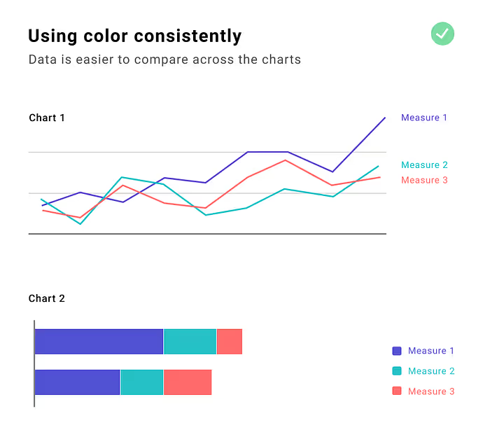
- Accessibility: Use colour palettes that are accessible to people with various forms of colour blindness. Tools like "ColorBrewer" offer palettes that are designed for accessibility. Supplement colour with other visual cues (e.g., shapes, lines, patterns) to ensure the information is interpretable without relying solely on colour. Consider adding labels, symbols, or patterns so that your visualisation remains readable even if colour isn’t visible
- Choose an appropriate background colour. While whites and blacks are acceptable background colours, the contrast can be excessive. Consider similar alternatives like light and dark grey and navy.
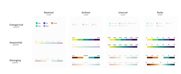
To select the appropriate colour palette, it's essential to understand the relationship between palette types and scale types. There are four scale types: nominal, ordinal, interval, and ratio. Correspondingly, there are three colour palette types: categorical (or qualitative), sequential, and diverging. Each scale type is best matched with a specific palette type.
10. Font choice
Make sure to choose a legible font, size and contrast for your dashboard, particularly in areas with a lot of text. Remember, if the content is hard to read, the user simply won't read it. Avoid using ornate and cursive text. It is always good practice to maintain consistency and use the same font as much as possible. The rule of thumb is 2 fonts – One for headings and the title, the other for body text.
Another essential factor for legibility is contrast. Generally, the smaller the text, the higher the contrast needs to be. The Web Content Accessibility Guidelines (WCAG) 2.0 recommend the following minimum contrast ratios between text and background:
- 4.5:1 for small text (e.g., labels, numbers)
- 3:1 for large text (at least 18 points or 14 points if bold)
You can use tools like Contrast Checker or WebAIM to verify contrast levels.
11. Layout
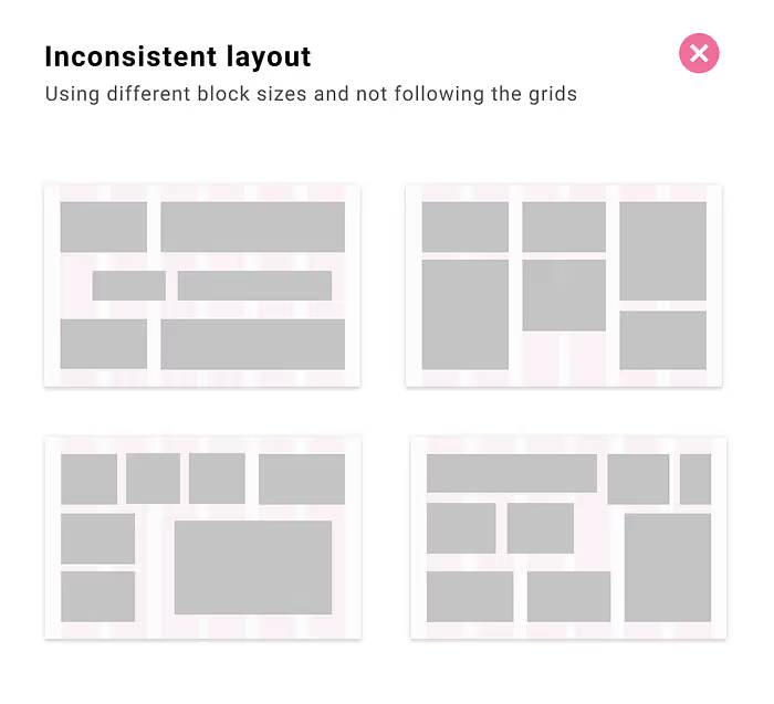
Use grids as much as possible. This will help standardise your building block sizes. It enables you to work with multiple "widgets" that can contain information, charts, and controls. Standardised cards are easy to organise and highly flexible. If you're considering a responsive design (allowing users to rearrange the position of cards), they are an excellent choice to implement.
VIII. Conclusion
Ultimately, good data visualisation techniques strike the right balance between clarity and creativity. By using the right mix of visuals, text, and interactivity, you can make data not only more accessible but also more engaging. Keep things simple, highlight what matters, and guide your audience through the story your data is telling. Stick to these principles, and you’ll turn even the most complex data into something people can understand and enjoy. If you want to get started with data visualisation and don’t know where to begin, check out our Top Data Visualisation Tools for 2024: A Comprehensive Guide. For Python users, you can enrol in our free Data Visualisation with Python course.
Useful links:
- Chart.Guide – Helps you choose and design the perfect chart.
- Coolors.co - A handy website to help you choose a colour palette.
- Adobe Fonts and Google Fonts – to access a huge library of fonts.
- Canva – A graphic design website which also incorporates data visualisation.
Tableau Public – View inspirational and trending dashboards that can even be downloaded.


.avif)
