

Learn the fundamentals of statistics, including its importance, types of data, descriptive vs. inferential statistics, data collection methods, sampling techniques, and common biases in research.
What is Statistics?
Statistics is like a superpower for understanding numbers. It’s all about collecting, organizing, analyzing, and interpreting data. When you hear the word "data," think of it as information. It could be numbers, words, or even pictures.
Statistics helps us answer questions like, “What’s typical?”, “What’s unusual?”, and “What happens next?”
Quick Links:
Descriptive and Inferential Statistics
Types of Data- Categorical, Numerical, Discrete and Continuous
Collecting data – Population vs Sample
Sampling – How to Pick the Right People
Bias in Data Collection
Descriptive and Inferential Statistics
There are two main branches of statistics, and they each do something different.
Descriptive Statistics
This is all about summarizing the data you have. Imagine you just took a survey about everyone’s favorite pizza toppings in your school. Descriptive stats will give you numbers like averages, totals, or tables to show what people said.
Example:
- 300 people surveyed.
- 150 chose pepperoni.
- 50% of people LOVE pepperoni.
It’s like holding up a snapshot of what happened.
Inferential Statistics
This is where stats gets a little more like magic. Inferential stats lets us take a small sample of data and make predictions about a bigger group.
Example:
- You survey 200 students out of 5,000 in your college.
- Inferential statistics helps you guess what all 5,000 students probably think based on the smaller group!
It’s like using a trailer to figure out if you’ll like the whole movie (but with math).
Types of Data
There are two big categories of data you’ll run into –
- Categorical or Qualitative Data and
- Numerical or Quantitative Data
Categorical Data
This type of data describes qualities or characteristics. It’s anything that can’t be counted with numbers.
- Example: Colors of cars (red, blue, black).
- Another example: Types of pets (dog, cat, hamster)
Categorical data is further divided into:
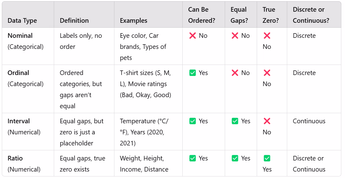
1. Nominal Data – “Name It” Data
Think: Categories with no ranking
Nominal = “Name only.” These are just labels with no order—like different flavors of ice cream. You can’t say one is "greater" or "less than" another (even if you have a favorite!).
Examples:
- Eye color: Brown, Blue, Green
- Types of pets: Dog, Cat, Parrot
- Car brands: Toyota, Ford, BMW
Key rule? You can’t logically sort them from best to worst. They're just different, not ranked!
2. Ordinal Data – “Order Matters” Data
Think: Categories WITH a ranking
Ordinal sounds like "order," so there’s a meaningful sequence, but the gap between ranks isn’t always equal.
Examples:
- T-shirt sizes: Small, Medium, Large, XL (XL is bigger than Large, but by how much?)
- Education levels: High School, Bachelor’s, Master’s, PhD
- Customer reviews: Bad, Okay, Good, Excellent
Key rule? There’s a clear ranking, but you don’t know exact differences between levels.
Numerical Data
This data is all about quantities (how much or how many).
- Example 1: Your shoe size.
- Example 2: The number of fries in your fast food order.
Easy, right? If it’s words, it’s qualitative. If it’s numbers, it’s quantitative.
Just like Categorical data, Numerical data also has two types:
1. Interval Data – “Meaningful Gaps, But No True Zero”
Think: Numbers where differences make sense, but zero is just a placeholder.
With interval data, you can add and subtract values, and the gaps between numbers are equal. But here’s the catch: zero doesn’t mean “nothing.”
Examples:
- Temperature in Celsius or Fahrenheit (0°C doesn’t mean “no temperature,” it’s just another point on the scale.)
- Years on a timeline (The year 0 doesn’t mean “nothing happened before,” it’s just a starting point.)
Key rule? You can’t multiply or divide meaningfully. Saying “20°C is twice as hot as 10°C” makes no sense because 0°C isn’t the true “start” of heat.
2. Ratio Data – “The Real Deal with a True Zero”
Think: Numbers where zero means “nothing” and all math works!
Ratio data is like interval data, but with a true zero—meaning zero means none of what you’re measuring. This lets you do all math operations: add, subtract, multiply, and divide.
Examples:
- Height and weight (0 kg means no weight, and 100 kg is truly twice as heavy as 50 kg.)
- Income ($0 means no money, and $100K is twice as much as $50K.)
- Distance traveled (0 km means you didn’t move.)
Key rule? Zero means nothing (it’s not just a placeholder), so saying “twice as much” actually makes sense.
Discrete and Continuous Data
Discrete and continuous data aren’t separate types of data. They describe how numbers behave within interval and ratio data (because those are numerical).
1. Discrete Data – “Countable and No Decimals”
Think: Whole numbers, things you can count.
Discrete data consists of specific, separate values—you can’t have fractions or decimals in between.
Examples:
- Number of students in a class (You can have 25 students, but not 25.3 students, though that would be funny to think about.)
- Number of pets someone owns (You can have 2 dogs, but not 2.5 dogs.)
- Shoe sizes (Even though they have decimal points, they come in fixed steps like 7, 7.5, 8, etc.)
Key rule? If you can count it in whole numbers, it’s discrete!
2. Continuous Data – “Infinite Possibilities”
Think: Measurable things that can have decimals.
Continuous data can take any value within a range—it’s measured, not counted.
Examples:
- Height and weight (You can be 5.6 feet tall or 72.3 kg.)
- Temperature (It can be 25.3°C or 98.76°F.)
- Time taken to run a race (Could be exactly 12.483 seconds.)
Key rule? If you can measure it and it can have any decimal value, it’s continuous!
Here’s a cheat sheet to sum it up:
- If it’s just a name, it’s nominal.
- If it’s ordered but uneven, it’s ordinal.
- If zero is just a point, it’s interval.
- If zero means none, it’s ratio.
- If you count it, it’s discrete.
- If you measure it, it’s continuous.
Collecting Data
Alright, so you know about different types of data. But where does all this data come from? How do you collect it in a way that actually makes sense?
Populations vs. Samples – Do You Need Everybody or Just Somebody?
Imagine you want to find out the average height of people in your city.
You could measure every single person (that’s your population).
OR you could measure a smaller group and use that to estimate the whole city (that’s your sample).
- Population = The entire group you care about
- Sample = A smaller group taken from the population
Real-Life Example:
- If a company wants to know how all customers feel about their product, their population = all customers.
- Since asking everyone is too expensive and time-consuming, they survey a few thousand customers instead. That’s their sample.
The Goal? Make sure your sample represents the population accurately—otherwise, your results will be garbage.
Sampling Methods – Picking the Right People
There are different ways to choose a sample, and some are way better than others.
- Simple Random Sampling
Aka the “lottery” method.
- Everyone has an equal chance of being picked.
- Imagine putting everyone’s name in a hat and picking a few at random.
- Example: A university randomly selects 200 students from a list of all students.
Pros: Super fair, easy to understand.
Cons: Not always practical (like if your population is spread across the world)
- Stratified Sampling
Aka the “Organised Random” method
- You split people into groups (strata) and then randomly pick from each group.
- Example: If a school wants to survey students, but they want to make sure they have students from each grade level, they divide students by grade and then pick randomly within each grade.
Pros: More accurate because it ensures all groups are included.
Cons: Takes more effort to organize.
- Cluster Sampling
Aka the “Random Groups” method
- Instead of picking individuals, you randomly select entire groups (clusters).
- Example: Instead of surveying individual people across a city, you randomly pick 5 neighbourhoods and survey everyone in them.
Pros: Super convenient for large populations.
Cons: Risky if the chosen clusters aren’t diverse.
- Systemic Sampling
Aka the “Every Nth Person” Method
- Pick every nth person from a list.
- Example: If you have 1,000 people and need 100, you pick every 10th person.
Pros: Quick and simple.
Cons: If there’s a pattern in the list, it might accidentally create bias.
- Convenience Sampling (Avoid This!)
- You pick whoever is easy to reach—like your friends, coworkers, or people walking by.
- Example: A student surveys only their classmates because it’s easier.
Pros: Fast and cheap.
Cons: Usually very biased and doesn’t represent the whole population.
- Danger! If your sample is biased, your results will be useless.
Bias in Data Collection – How to Accidentally Ruin Your Study
Even if you pick a good sample, you can still mess things up. Here’s how:
- Selection Bias
When you pick the “wrong people.”
Problem: Your sample doesn’t represent the whole population.
Example: A political poll only surveys rich neighbourhoods, so it misses the opinions of lower-income voters.
- Non-Response Bias
When people ignore you.
Problem: The people who answer surveys aren’t random—they might have strong opinions.
Example: A restaurant emails surveys to customers, but only angry people respond.
- Leading Questions
When you “force” an answer.
Problem: The way you ask a question pushes people toward a certain answer.
Example:
Bad question: “Don’t you agree that our product is amazing?”
Better question: “How would you rate our product?”
- Social Desirability Bias
When people lie to look good.
Problem: People don’t always tell the truth if the truth makes them look bad.
Example: Asking people how much they exercise—they might say “5 times a week” even if they haven’t hit the gym in months.
The Golden Rules of Collecting Data
- Use a sampling method that makes sense (random > convenience).
- Make sure your sample represents the whole population.
- Avoid bias in both who you pick and how you ask questions.
- Check if people are answering honestly (or just trying to look good).
Get this right, and your data will be solid gold. Get it wrong, and your study is worthless.
So, you’ve done all the hard work of collecting data (hopefully without too much bias or messing up your sample). But right now, your data is probably just a messy list of numbers or responses.
Imagine this: You surveyed 100 people about their favourite ice cream Flavors. Now you have a big pile of answers like:
- Chocolate, Vanilla, Chocolate, Strawberry, Mint, Chocolate, Vanilla, Mint, Chocolate…
If you just stare at this list, it doesn’t mean much. How do you make sense of it?
That’s where organizing data comes in! In the next chapter, we’ll turn raw data into easy-to-read tables, charts, and graphs so you can actually see patterns and trends—instead of drowning in numbers.
Up Next: We’ll learn how to count and sort data using tables, and interpret the data using measures.
.avif)


.jpeg)


.avif)
