


Introduction to K-Means Clustering
K-Means clustering is one of the most widely used algorithms in unsupervised machine learning, primarily because of its simplicity and efficiency. It works by grouping data points into a pre-specified number (k) of clusters based on their similarity. The algorithm iteratively refines cluster assignments until the optimal groupings are achieved.
What is K-Means Clustering?
At its core, K-Means aims to partition n data points into k clusters by minimizing the variance within each cluster. This is achieved by:
- Assigning each data point to the nearest cluster centroid.
- Updating the centroids based on the mean of the points in each cluster.
- Repeating these steps until convergence.
Applications of K-Means
- Customer Segmentation: Group customers based on purchasing behavior for targeted marketing.
- Image Compression: Reduce the number of colors in an image by clustering pixels.
- Document Clustering: Organize large text corpora into related topics.
- Anomaly Detection: Identify irregular patterns in datasets, such as fraud detection in financial data.
Advantages of K-Means
- Scalability: Efficient for large datasets.
- Simplicity: Easy to understand and implement.
- Flexibility: Works for a variety of clustering problems.
Limitations of K-Means
- Predefined k: The number of clusters must be specified beforehand, which may not always be obvious.
- Sensitivity to Initialization: Poor initialization can lead to suboptimal results.
- Outliers: Can be heavily influenced by outliers, distorting the cluster structure.
- Assumption of Spherical Clusters: K-Means performs poorly on non-globular cluster shapes.
Example:
Consider a retail dataset where each data point represents a customer’s annual income and spending score. Using K-Means, we can group customers into distinct segments like "high spenders" or "budget-conscious buyers."
Understanding the Dataset
To apply K-Means clustering effectively, it’s crucial to understand the structure and nature of the dataset you’re working with. This section highlights the importance of dataset characteristics and introduces an example dataset to demonstrate the clustering process.
Importance of Dataset Understanding
The success of K-Means largely depends on the quality and structure of the data:
- Numerical Features: Since K-Means relies on Euclidean distance, numerical data works best. Categorical data requires preprocessing or alternative methods like K-Modes.
- Clustering Tendencies: The dataset should exhibit natural groupings or clusters. Visual exploration using pair plots or scatter plots can help detect clustering potential.
- Noisy Data: Too much noise or irrelevant features can obscure the clusters, necessitating feature selection or engineering.
Example Dataset
Let’s take the Iris dataset as an example to illustrate K-Means clustering.
Dataset Overview:
- Features:some text
- Sepal length (cm)
- Sepal width (cm)
- Petal length (cm)
- Petal width (cm)
- Objective: Group flowers into clusters based on these features.
- Known Classes: The dataset contains three species of iris flowers, but we’ll assume we don’t know this information (unsupervised learning).
Steps to Explore the Dataset:
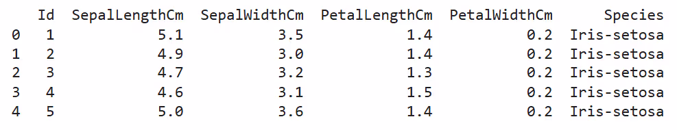
- Inspect Data: View the first few rows to understand feature distributions and ranges.
import pandas as pd
df = pd.read_csv('iris.csv')
print(df.head())
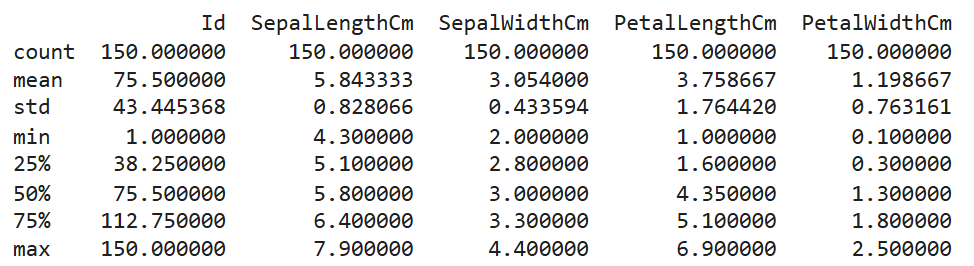
- Check Summary Statistics: Identify feature ranges and central tendencies.
print(df.describe())
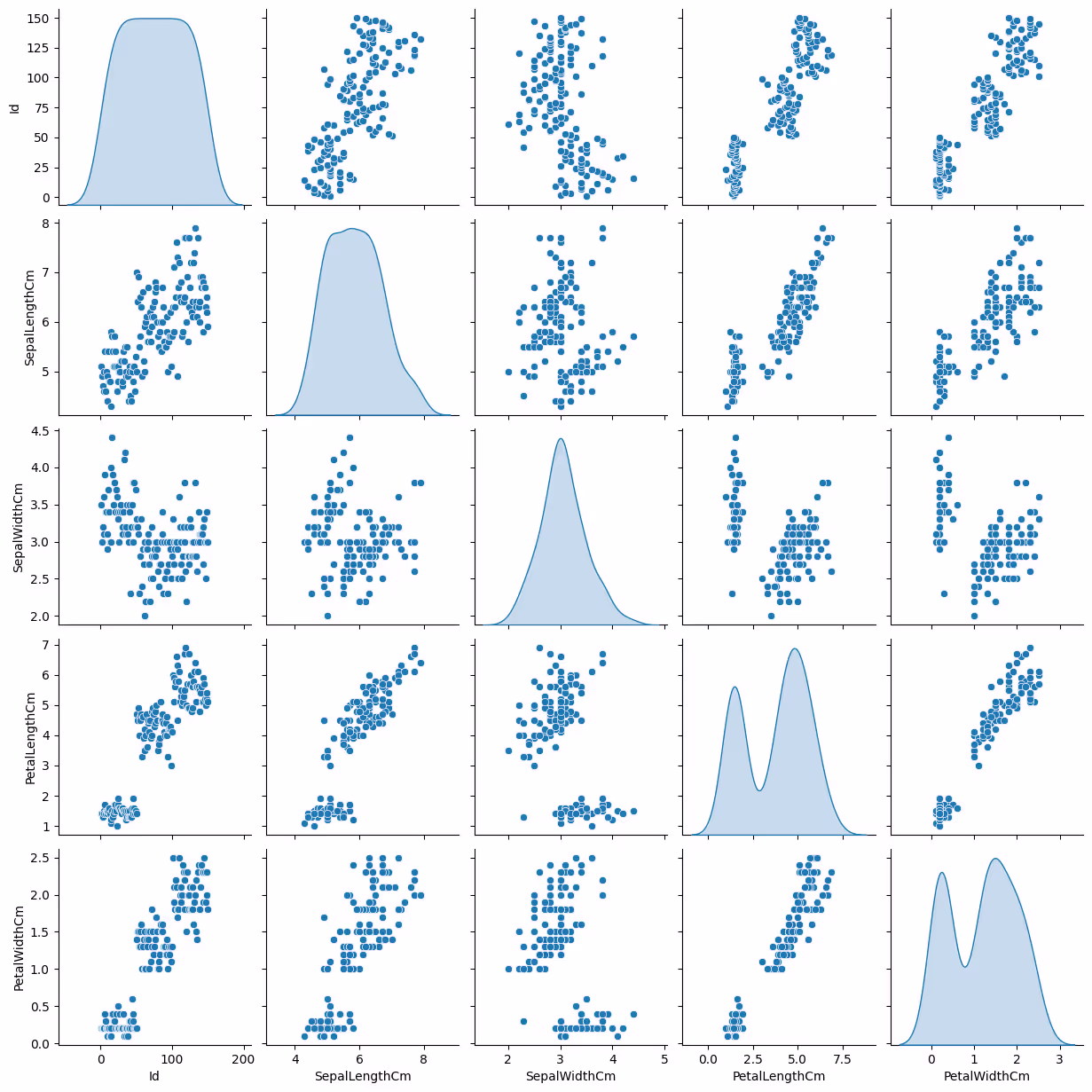
- Visualize Relationships: Use scatter plots to observe patterns.
import seaborn as sns
sns.pairplot(df, diag_kind='kde')
Characteristics of a Good Dataset for K-Means
- Compact Clusters: Points within each cluster should be close to the centroid.
- Separation: Clusters should be well-separated for clear boundaries.
- Balanced Features: Features should be scaled to avoid dominance of large-magnitude attributes.
Why Dataset Understanding Matters
Without a thorough understanding of the dataset:
- You may miss preprocessing needs, like scaling or handling missing values.
- You could select inappropriate features, leading to meaningless clusters.
- You might misinterpret the results or their significance.
Now we’ll explore Data Preprocessing, which is critical for improving the quality and interpretability of clusters.
Data Preprocessing for K-Means Clustering
Data preprocessing is a crucial step in preparing your dataset for K-Means clustering. Since the algorithm relies on calculating distances between data points, improperly processed data can lead to inaccurate clustering results.
Why Preprocessing Matters
- Distance Dependence: K-Means uses Euclidean distance, which can be biased by unscaled or noisy data.
- Feature Contribution: Features with larger ranges dominate clustering results if not scaled.
- Noise and Outliers: Irrelevant or extreme values can distort the cluster structure.
Steps in Data Preprocessing
1. Handling Missing Values
Missing data can affect the computation of cluster centroids. Address this issue by:
- Imputation: Replace missing values with the mean, median, or mode of the respective feature.
- Removal: If the percentage of missing values is low, drop the affected rows or columns.
Code Example:
from sklearn.impute import SimpleImputer
import pandas as pd
df = pd.read_csv('data.csv')
imputer = SimpleImputer(strategy='mean') # Replace missing values with mean
df_cleaned = pd.DataFrame(imputer.fit_transform(df), columns=df.columns)
2. Scaling and Normalization
Features with varying scales can skew results. For instance, a feature measured in kilometers will outweigh another measured in centimeters. Scaling ensures all features contribute equally.
- Standardization: Scales data to have a mean of 0 and standard deviation of 1.
- Normalization: Rescales features to a [0, 1] range, often used for bounded data.
Code Example:
from sklearn.preprocessing import StandardScaler
scaler = StandardScaler()
df_scaled = scaler.fit_transform(df_cleaned)
3. Dimensionality Reduction
High-dimensional data can make clustering computationally expensive and harder to interpret. Dimensionality reduction techniques, like Principal Component Analysis (PCA), can help:
- Reduce the number of features.
- Retain the majority of the data’s variance.
Code Example:
from sklearn.decomposition import PCA
pca = PCA(n_components=2)
df_reduced = pca.fit_transform(df_scaled)
4. Handling Outliers
Outliers can pull centroids away from true cluster centers, distorting the clustering. Detect and address them using:
- Z-Score: Flag points with high Z-scores as outliers.
- IQR (Interquartile Range): Identify values outside the IQR range.
Code Example:
import numpy as np
z_scores = np.abs((df_scaled - df_scaled.mean()) / df_scaled.std())
df_no_outliers = df_cleaned[(z_scores < 3).all(axis=1)]
5. Feature Selection
Irrelevant features can introduce noise and reduce clustering accuracy. Use techniques like:
- Correlation Analysis: Remove highly correlated features.
- Feature Importance: Leverage feature selection algorithms to identify key attributes.
Code Example:
import seaborn as sns
import matplotlib.pyplot as plt
sns.heatmap(pd.DataFrame(df_scaled).corr(), annot=True, cmap='coolwarm')
plt.show()
Preprocessed Dataset
After preprocessing, your dataset will:
- Be free of missing values and outliers.
- Have scaled and normalized features.
- Potentially reduced dimensions for efficiency.
Practical Tips
- Always scale your data before clustering.
- Use domain knowledge to select meaningful features.
- Visualize preprocessed data to ensure the quality of preprocessing.
Also Read: Data Preprocessing in Machine Learning: A Guide to Cleaning and Preparing Data
Key Concepts of K-Means
To implement K-Means effectively, it’s important to understand the algorithm's fundamental principles and mechanisms. This section explains the core concepts that drive K-Means clustering and provides insights into how it works under the hood.
1. Centroids
Centroids are the central points of each cluster. In K-Means:
- The number of centroids equals the number of clusters (k).
- Centroids are recalculated at each iteration as the mean of all data points in a cluster.
- They represent the "average" position of data points within their cluster.
2. Euclidean Distance
The algorithm uses Euclidean distance to assign data points to clusters. This distance is calculated as:
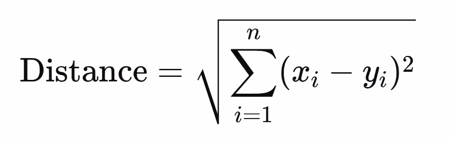
Where xi and yi are the feature values of a data point and the centroid, respectively.
3. Objective Function
K-Means minimizes the Sum of Squared Errors (SSE) or Inertia, defined as:
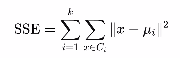
Where:
- Ci is the i-th cluster.
- μi\mu_i is the centroid of Ci.
- ∥x−μi∥ is the distance between a data point and its cluster's centroid.
This function ensures that data points are grouped closely around centroids.
4. The K-Means Algorithm
The K-Means algorithm operates in the following steps:
- Initialization:
some text- Randomly select k initial centroids from the data points.
- Assignment:
some text- Assign each data point to the cluster with the nearest centroid.
- Update:
some text- Recalculate centroids as the mean of all points in a cluster.
- Iteration:
some text- Repeat the assignment and update steps until the centroids no longer change (convergence) or a maximum number of iterations is reached.
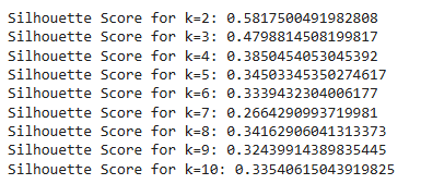
5. Choosing k (Number of Clusters)
Determining the right number of clusters is critical. Common methods include:
- Elbow Method: Plot SSE against the number of clusters and look for the "elbow point," where the rate of SSE decrease slows.
- Silhouette Score: Measures how similar a data point is to its own cluster compared to other clusters. Values close to 1 indicate well-separated clusters.
Code Example:
from sklearn.cluster import KMeans
import matplotlib.pyplot as plt
sse = []
for k in range(1, 11):
kmeans = KMeans(n_clusters=k, random_state=42)
kmeans.fit(df_scaled)
sse.append(kmeans.inertia_)
plt.plot(range(1, 11), sse, marker='o')
plt.xlabel('Number of Clusters')
plt.ylabel('SSE')
plt.title('Elbow Method')
plt.show()
6. Random Initialization and the Need for Multiple Runs
K-Means is sensitive to the initial choice of centroids. To mitigate this, the algorithm is often run multiple times with different centroid seeds, and the best result is chosen.
7. Stopping Criteria
The algorithm stops when:
- Centroids no longer change significantly between iterations (convergence).
- A pre-defined number of iterations is reached.
8. Assumptions of K-Means
- Clusters are spherical and equally sized.
- Features are numeric and scaled.
- There are no significant outliers.
Visual Representation of K-Means
Imagine a dataset of points on a 2D plane:
- Initial centroids are placed randomly.
- Points are assigned to the nearest centroid, forming clusters.
- Centroids are recalculated, shifting closer to the center of their clusters.
- This process repeats until the clusters stabilize.
Also Read: Top Data Visualization Tools to Boost Your Analytics Game
Implementing K-Means Clustering in Python
Now that you understand the theoretical foundation of K-Means clustering, let’s dive into the practical implementation. This section provides a step-by-step guide to applying K-Means in Python using the scikit-learn library.
Step 1: Import Necessary Libraries
First, import the essential libraries for data manipulation, clustering, and visualization.
Code Example:
import pandas as pd
import numpy as np
import matplotlib.pyplot as plt
import seaborn as sns
from sklearn.cluster import KMeans
from sklearn.preprocessing import StandardScaler
Step 2: Load and Inspect the Dataset
Load the dataset and inspect its structure to understand the features and rows.
Code Example:
# Load dataset (e.g., Iris dataset)
from sklearn.datasets import load_iris
iris = load_iris()
df = pd.DataFrame(iris.data, columns=iris.feature_names)
print(df.head()) # Display the first few rows
Step 3: Preprocess the Data
Scale the dataset to ensure all features contribute equally to the distance calculations.
Code Example:
scaler = StandardScaler()
df_scaled = scaler.fit_transform(df)
Step 4: Apply the K-Means Algorithm
Initialize and fit the K-Means algorithm. Choose the number of clusters (k) based on your problem or use methods like the elbow method to decide.
Code Example:
# Define the number of clusters
kmeans = KMeans(n_clusters=3, random_state=42)
# Fit the model
kmeans.fit(df_scaled)
# Get cluster labels
labels = kmeans.labels_
print("Cluster Labels:", labels)
Step 5: Add Cluster Labels to the Dataset
Append the cluster labels to the original dataset for easier interpretation and visualization.
Code Example:
df['Cluster'] = labels
print(df.head()) # View the dataset with cluster labels
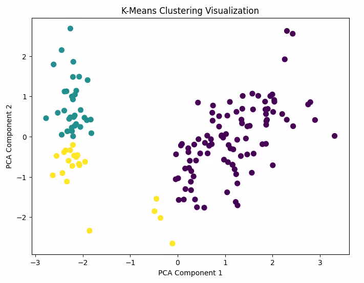
Step 6: Visualize the Clusters
Use a scatter plot to visualize the clusters. For simplicity, reduce the dataset to two dimensions using PCA.
Code Example:
from sklearn.decomposition import PCA
# Reduce dimensions to 2 for visualization
pca = PCA(n_components=2)
df_pca = pca.fit_transform(df_scaled)
# Create a scatter plot
plt.figure(figsize=(8, 6))
plt.scatter(df_pca[:, 0], df_pca[:, 1], c=labels, cmap='viridis', s=50)
plt.title('K-Means Clustering Visualization')
plt.xlabel('PCA Component 1')
plt.ylabel('PCA Component 2')
plt.show()
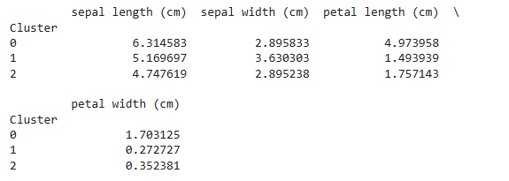
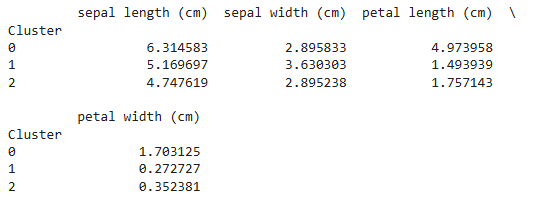
Step 7: Analyze the Results
Examine the characteristics of each cluster to understand their composition. You can compute the mean of each feature for each cluster.
Code Example:
# Calculate cluster-wise feature means
cluster_means = df.groupby('Cluster').mean()
print(cluster_means)
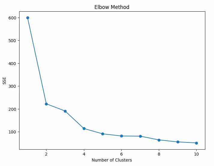
Step 8: Optimize the Number of Clusters
Use the Elbow Method to determine the optimal number of clusters.
Code Example:
sse = []
for k in range(1, 11):
kmeans = KMeans(n_clusters=k, random_state=42)
kmeans.fit(df_scaled)
sse.append(kmeans.inertia_)
# Plot the elbow curve
plt.figure(figsize=(8, 6))
plt.plot(range(1, 11), sse, marker='o')
plt.title('Elbow Method')
plt.xlabel('Number of Clusters')
plt.ylabel('SSE')
plt.show()
Step 9: Silhouette Score for Validation
Evaluate the quality of clustering using the Silhouette Score. A higher score indicates better-defined clusters.
Code Example:
from sklearn.metrics import silhouette_score
score = silhouette_score(df_scaled, labels)
print(f"Silhouette Score: {score}")

Step 10: Save and Share Results
Save the processed dataset with cluster labels for further analysis.
Code Example:
df.to_csv('clustered_data.csv', index=False)
print("Clustered data saved to 'clustered_data.csv'")
By following these steps, you’ll be able to implement K-Means clustering effectively in Python. Next, we’ll discuss how to evaluate the performance of your clustering model.
Evaluating K-Means Performance
Evaluating the performance of K-Means clustering ensures that the identified clusters are meaningful and aligned with the data's structure. Unlike supervised learning, clustering lacks labeled data for direct comparison, so we rely on specific evaluation metrics and techniques.
1. Internal Validation Metrics
These metrics assess clustering quality using the data alone, without external labels.
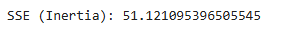
a. Sum of Squared Errors (SSE) or Inertia
- Measures the compactness of clusters.
- Lower SSE indicates better clustering.
- Calculated as the sum of squared distances between each point and its cluster centroid.
Code Example:
print(f"SSE (Inertia): {kmeans.inertia_}")
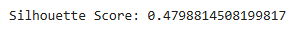
b. Silhouette Score
- Assesses how similar a point is to its own cluster versus others.
- Ranges from -1 to 1:some text
- 1: Well-separated clusters.
- 0: Overlapping clusters.
- -1: Incorrect clustering.
Code Example:
from sklearn.metrics import silhouette_score
sil_score = silhouette_score(df_scaled, labels)
print(f"Silhouette Score: {sil_score}")
c. Davies-Bouldin Index
- Measures the average similarity ratio between each cluster and its most similar one.
- Lower values indicate better clustering.
Code Example:
from sklearn.metrics import davies_bouldin_score
db_index = davies_bouldin_score(df_scaled, labels)
print(f"Davies-Bouldin Index: {db_index}")

2. Choosing the Optimal Number of Clusters
- Elbow Method: Choose the "elbow point" where SSE decreases rapidly.
- Silhouette Analysis: Evaluate silhouette scores for varying cluster counts.
Code Example for Silhouette Analysis:
for k in range(2, 11):
kmeans = KMeans(n_clusters=k, random_state=42)
kmeans.fit(df_scaled)
sil_score = silhouette_score(df_scaled, kmeans.labels_)
print(f"Silhouette Score for k={k}: {sil_score}")
3. Cluster Interpretability
Evaluate the characteristics of each cluster:
- Compare feature means across clusters.
- Look for meaningful differences that explain cluster composition.
Code Example:
cluster_summary = df.groupby('Cluster').mean()
print(cluster_summary)
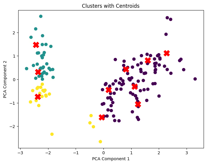
4. Visual Inspection
- 2D/3D Plots: Visualize the clusters using PCA or t-SNE for dimensionality reduction.
- Centroid Tracking: Overlay centroids to verify cluster assignments.
Code Example for Centroid Visualization:
plt.figure(figsize=(8, 6))
plt.scatter(df_pca[:, 0], df_pca[:, 1], c=labels, cmap='viridis', s=50)
centroids = kmeans.cluster_centers_
centroids_pca = PCA(n_components=2).fit_transform(centroids) # Transform centroids
plt.scatter(centroids_pca[:, 0], centroids_pca[:, 1], c='red', marker='X', s=200)
plt.title('Clusters with Centroids')
plt.xlabel('PCA Component 1')
plt.ylabel('PCA Component 2')
plt.show()
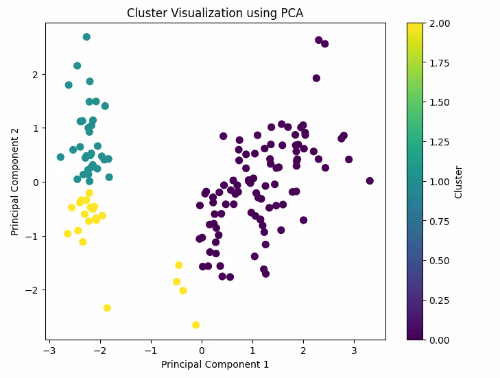
5. Practical Evaluation Considerations
- Cluster Size Balance: Check if clusters are too small or too large, indicating potential imbalance.
- Domain Knowledge: Validate clustering results using insights from the data's context.
- Stability: Run the algorithm multiple times to check if results vary significantly due to random initialization.
Code Example for Multiple Runs:
for i in range(5): # Perform 5 runs
kmeans = KMeans(n_clusters=3, random_state=i)
kmeans.fit(df_scaled)
print(f"Run {i+1}, SSE: {kmeans.inertia_}")
6. Common Issues in Evaluation
- Overlapping clusters: Can reduce silhouette scores.
- Poor initialization: Leads to suboptimal clustering results. Use the k-means++ initialization method to address this.
- Outliers: Can distort cluster centroids and evaluations. Remove outliers during preprocessing.
With proper evaluation, you can ensure that your clustering results are reliable and meaningful.
Visualizing K-Means Results
Visualizing K-Means clustering results is a critical step in understanding the structure and quality of the clusters. Effective visualization helps identify patterns, validate assumptions, and communicate findings to others. Here’s a detailed guide to visualizing K-Means results.
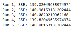
1. Visualizing Clusters in 2D
If your data has only two features, you can plot them directly to observe cluster separation.
Code Example:
plt.figure(figsize=(8, 6))
plt.scatter(df_scaled[:, 0], df_scaled[:, 1], c=labels, cmap='viridis', s=50)
plt.title('2D Cluster Visualization')
plt.xlabel('Feature 1')
plt.ylabel('Feature 2')
plt.colorbar(label='Cluster')
plt.show()
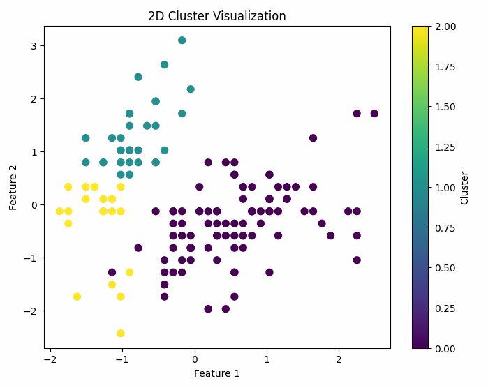
2. Visualizing Clusters in High-Dimensional Data
When your data has multiple features, you can reduce dimensionality to 2 or 3 using techniques like PCA or t-SNE.
a. PCA (Principal Component Analysis)
PCA reduces the dataset to its most important dimensions while retaining variance.
Code Example:
from sklearn.decomposition import PCA
# Reduce to 2 dimensions
pca = PCA(n_components=2)
df_pca = pca.fit_transform(df_scaled)
# Plot clusters in PCA space
plt.figure(figsize=(8, 6))
plt.scatter(df_pca[:, 0], df_pca[:, 1], c=labels, cmap='viridis', s=50)
plt.title('Cluster Visualization using PCA')
plt.xlabel('Principal Component 1')
plt.ylabel('Principal Component 2')
plt.colorbar(label='Cluster')
plt.show()
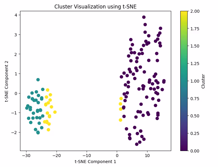
b. t-SNE (t-Distributed Stochastic Neighbor Embedding)
t-SNE is another powerful dimensionality reduction technique that often provides better visualization for complex data.
Code Example:
from sklearn.manifold import TSNE
# Reduce to 2 dimensions
tsne = TSNE(n_components=2, random_state=42)
df_tsne = tsne.fit_transform(df_scaled)
# Plot clusters in t-SNE space
plt.figure(figsize=(8, 6))
plt.scatter(df_tsne[:, 0], df_tsne[:, 1], c=labels, cmap='viridis', s=50)
plt.title('Cluster Visualization using t-SNE')
plt.xlabel('t-SNE Component 1')
plt.ylabel('t-SNE Component 2')
plt.colorbar(label='Cluster')
plt.show()
3. Visualizing Centroids
Overlay centroids onto your cluster plots to highlight cluster centers and observe their positions.
Code Example:
plt.figure(figsize=(8, 6))
plt.scatter(df_pca[:, 0], df_pca[:, 1], c=labels, cmap='viridis', s=50)
centroids_pca = PCA(n_components=2).fit_transform(kmeans.cluster_centers_)
plt.scatter(centroids_pca[:, 0], centroids_pca[:, 1], c='red', marker='X', s=200)
plt.title('Clusters with Centroids')
plt.xlabel('Principal Component 1')
plt.ylabel('Principal Component 2')
plt.show()
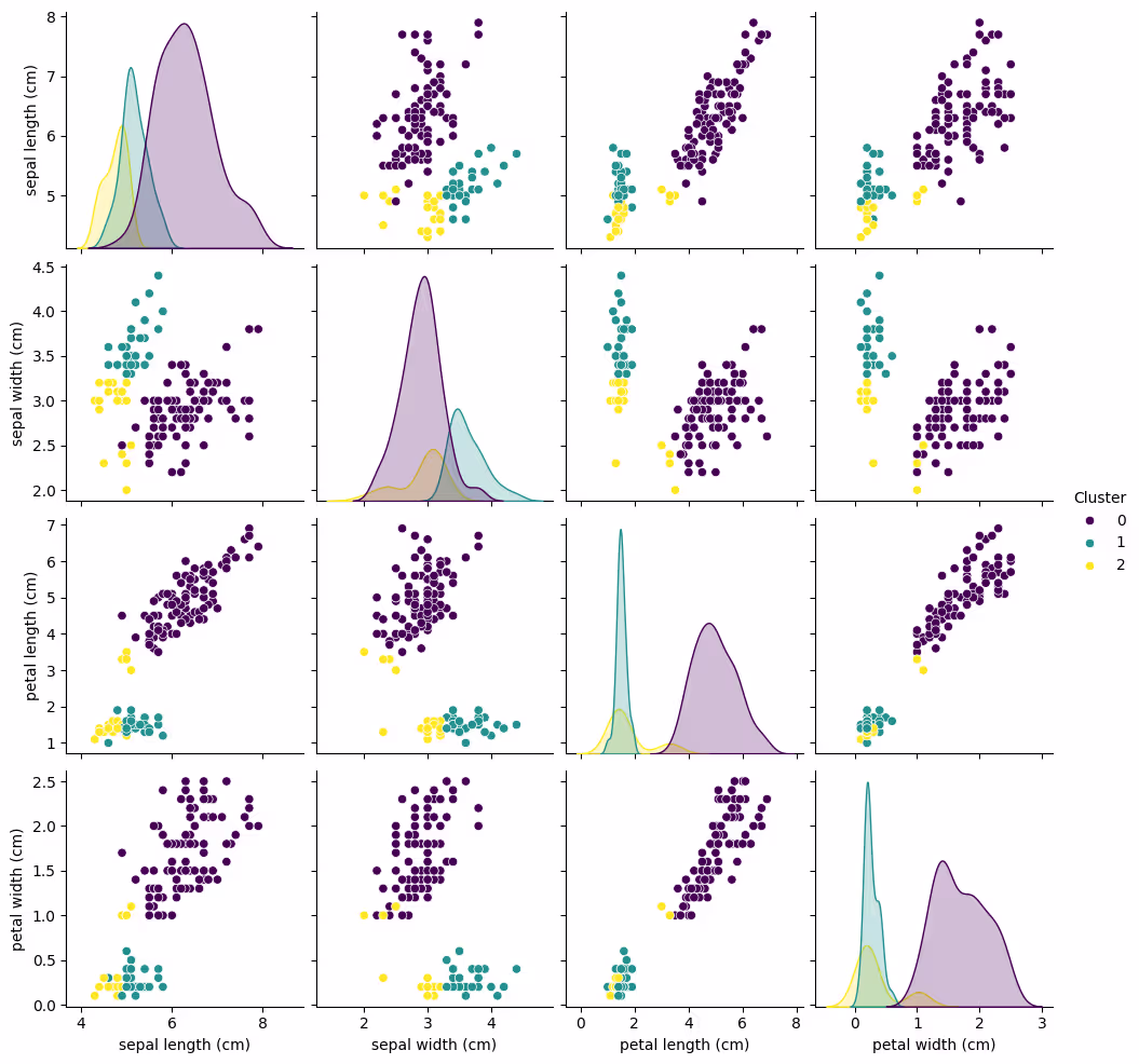
4. Pair Plot for Feature Analysis
Use a pair plot to explore how clusters separate across all feature combinations.
Code Example:
import seaborn as sns
# Add cluster labels to the original DataFrame
df['Cluster'] = labels
# Pair plot with hue as clusters
sns.pairplot(df, hue='Cluster', diag_kind='kde', palette='viridis')
plt.show()
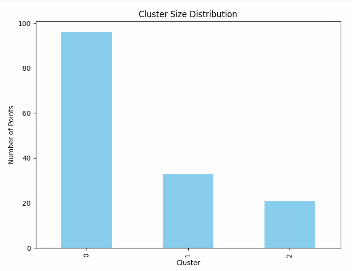
5. Cluster Size Distribution
Visualize the size of each cluster to ensure balance and identify outliers.
Code Example:
# Count the number of points in each cluster
cluster_counts = df['Cluster'].value_counts()
# Bar plot of cluster sizes
plt.figure(figsize=(8, 6))
cluster_counts.plot(kind='bar', color='skyblue')
plt.title('Cluster Size Distribution')
plt.xlabel('Cluster')
plt.ylabel('Number of Points')
plt.show()
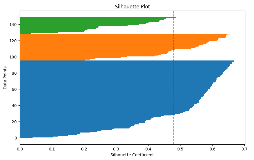
6. Silhouette Plot
Visualize the silhouette coefficient for each data point to assess how well each cluster is separated.
Code Example:
from sklearn.metrics import silhouette_samples
silhouette_vals = silhouette_samples(df_scaled, labels)
plt.figure(figsize=(10, 6))
y_lower, y_upper = 0, 0
for i in range(kmeans.n_clusters):
cluster_silhouette_vals = silhouette_vals[labels == i]
cluster_silhouette_vals.sort()
y_upper += len(cluster_silhouette_vals)
plt.barh(range(y_lower, y_upper), cluster_silhouette_vals, edgecolor='none', height=1)
y_lower += len(cluster_silhouette_vals)
plt.axvline(np.mean(silhouette_vals), color='red', linestyle='--')
plt.title('Silhouette Plot')
plt.xlabel('Silhouette Coefficient')
plt.ylabel('Data Points')
plt.show()
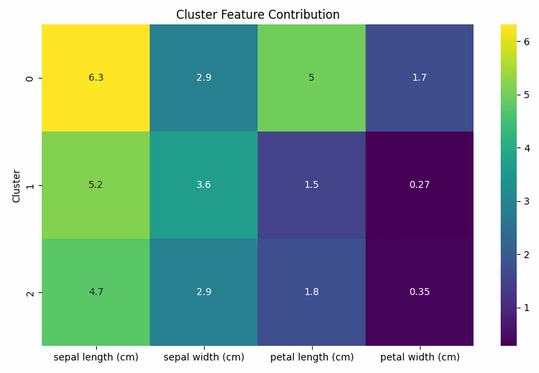
7. Heatmap for Feature Contribution
Use a heatmap to show how features contribute to the formation of each cluster.
Code Example:
# Calculate cluster-wise feature means
cluster_means = df.groupby('Cluster').mean()
# Plot heatmap
plt.figure(figsize=(10, 6))
sns.heatmap(cluster_means, annot=True, cmap='viridis')
plt.title('Cluster Feature Contribution')
plt.show()
Visualizing clustering results is essential for interpreting and validating your findings.
Also read: Top Data Visualization Tools for 2024: A Comprehensive Guide
Practical Challenges in K-Means
While K-Means clustering is widely used and relatively easy to implement, it presents several practical challenges that can impact the quality and reliability of the results. Let’s explore these challenges and strategies to overcome them.
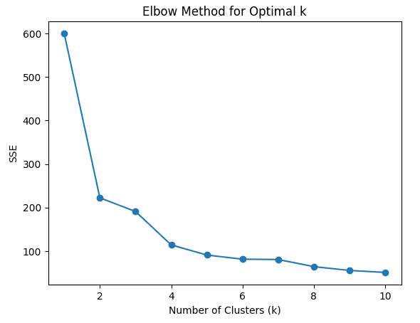
1. Choosing the Right Number of Clusters (k)
One of the most significant challenges in K-Means is determining the optimal number of clusters (k). Setting an inappropriate k can lead to poorly defined clusters, affecting the overall performance of the algorithm.
Solutions:
- Elbow Method: As discussed earlier, this method helps determine the point where the SSE starts to decrease more slowly, indicating the optimal k.
- Silhouette Score: It’s helpful to compare silhouette scores across different k values. A higher silhouette score suggests better-defined clusters.
- Gap Statistic: Another advanced method that compares the clustering performance to a random distribution of points.
Code Example (Elbow Method):
sse = []
for k in range(1, 11):
kmeans = KMeans(n_clusters=k, random_state=42)
kmeans.fit(df_scaled)
sse.append(kmeans.inertia_)
plt.plot(range(1, 11), sse, marker='o')
plt.title('Elbow Method for Optimal k')
plt.xlabel('Number of Clusters (k)')
plt.ylabel('SSE')
plt.show()
2. Sensitivity to Initialization
K-Means is sensitive to the initial placement of centroids. Poor initialization can lead to suboptimal clustering, as the algorithm may converge to a local minimum.
Solutions:
- K-Means++ Initialization: A smarter initialization method that spreads out the initial centroids, reducing the risk of poor initialization.
- Multiple Runs: Running K-Means multiple times with different initializations and selecting the best result can also mitigate this issue.
Code Example (K-Means++):
kmeans = KMeans(n_clusters=3, init='k-means++', random_state=42)
kmeans.fit(df_scaled)
3. Handling Outliers
Outliers can distort the results of K-Means, pulling the centroids toward themselves and leading to incorrect clustering.
Solutions:
- Outlier Detection and Removal: Use techniques like z-score or IQR (Interquartile Range) to identify and remove outliers before applying K-Means.
- Robust K-Means: Consider using variants of K-Means like K-Medoids or DBSCAN that are more robust to outliers.
Code Example for Outlier Detection (Z-Score):
from scipy.stats import zscore
df_scaled_zscore = df_scaled.apply(zscore)
# Remove outliers based on z-score (threshold of 3)
df_no_outliers = df_scaled_zscore[(df_scaled_zscore < 3).all(axis=1)]
4. High Dimensionality
When the dataset has too many features (high-dimensional data), K-Means clustering can become inefficient and the clusters may become indistinguishable. High-dimensional spaces suffer from the "curse of dimensionality," making it harder to find meaningful clusters.
Solutions:
- Dimensionality Reduction: Techniques like PCA (Principal Component Analysis) or t-SNE can be applied to reduce the number of features while retaining important information.
- Feature Selection: Selecting the most relevant features using techniques like mutual information or L1 regularization can also help improve clustering performance.
Code Example (PCA for Dimensionality Reduction):
pca = PCA(n_components=2)
df_pca = pca.fit_transform(df_scaled)
kmeans = KMeans(n_clusters=3, random_state=42)
kmeans.fit(df_pca)
5. Cluster Size Imbalance
K-Means assumes that clusters are spherical and of similar sizes, which might not hold in real-world data. If one cluster is much larger than others, the algorithm might fail to correctly identify the smaller clusters.
Solutions:
- Reconsider the Number of Clusters: Ensure that the number of clusters is appropriate for the data structure.
- Use Alternative Clustering Algorithms: Techniques like DBSCAN or Agglomerative Clustering are better suited for handling clusters of varying shapes and sizes.
- Balanced Initialization: Use initialization techniques that balance the cluster sizes more effectively.
6. Cluster Shape Assumption
K-Means assumes that clusters are spherical and evenly distributed in the feature space, which may not be the case in many real-world datasets. Complex shapes (e.g., elongated clusters or non-convex clusters) can result in poor clustering performance.
Solutions:
- Non-Spherical Clusters: Consider using other clustering algorithms like DBSCAN or Gaussian Mixture Models (GMM), which do not assume spherical shapes.
- Advanced K-Means Variants: Variants like K-Means++ (for better initialization) or Mini-Batch K-Means (for large datasets) may handle non-spherical shapes better than the standard K-Means.
7. Evaluating Cluster Quality
Evaluating the quality of clusters without ground truth labels is inherently difficult. Metrics like Silhouette Score, Davies-Bouldin Index, or visual methods can sometimes give conflicting results.
Solutions:
- Multiple Metrics: Use a combination of evaluation metrics to ensure robust cluster quality assessment.
- Domain Knowledge: Domain-specific insights or expert knowledge can be invaluable in interpreting clustering results and improving the evaluation process.
- Cross-validation: Use cross-validation techniques to validate the stability of clustering results.
8. Scalability Issues with Large Datasets
As the size of the dataset increases, the K-Means algorithm can become computationally expensive and time-consuming, especially when running multiple iterations and processing large numbers of features.
Solutions:
- Mini-Batch K-Means: This is a variant of K-Means that processes small random batches of data in each iteration, significantly speeding up the algorithm while maintaining performance.
- Parallel Processing: Utilize parallel processing frameworks to distribute the clustering task over multiple processors or machines.
Code Example (Mini-Batch K-Means):
from sklearn.cluster import MiniBatchKMeans
minibatch_kmeans = MiniBatchKMeans(n_clusters=3, random_state=42)
minibatch_kmeans.fit(df_scaled)
Conclusion
K-Means clustering is a versatile and powerful algorithm but it comes with several practical challenges, including selecting the optimal number of clusters, handling outliers, and dealing with high-dimensional data. By using techniques like dimensionality reduction, outlier removal, and alternative clustering algorithms, we can overcome these challenges and obtain meaningful clusters. With a sound understanding of these challenges and solutions, you can use K-Means more effectively in real-world applications.
This concludes our comprehensive guide on K-Means Clustering in Python, from preprocessing to visualization and tackling practical challenges. Feel free to experiment with different datasets and tweak the approaches based on your data’s unique characteristics!
Also Read: A Deep Dive into the Types of ML Models and Their Strengths


.jpeg)


.avif)

Lorem ipsum dolor sit amet, consectetur adipiscing elit. Suspendisse varius enim in eros elementum tristique. Duis cursus, mi quis viverra.